This is the eleventh in an ongoing series in which The Beat Magazine 2025 takes readers “Behind The Scenes” to meet the talented creative individuals who make the London area such a vibrant arts and culture community.
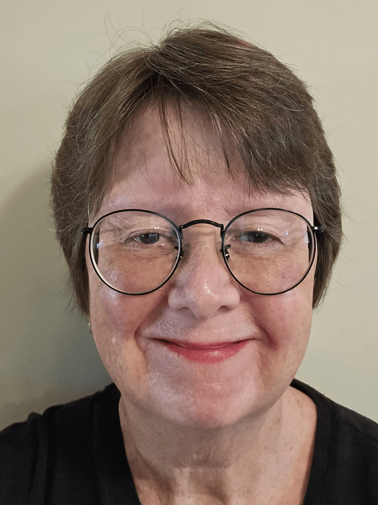
In this segment, Beth Stewart profiles London-based visual artist Jamie Jardine.
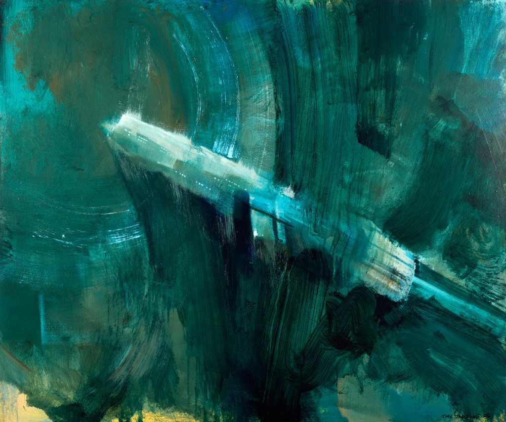
Jamie Jardine breaks his art down into three categories: landscape, abstraction and illustration. The reason for this spread is interesting.
When he enrolled in the Fine Art program at Fanshawe College in 1996, Jardine admits he didn’t know much about art history or the art world in general, and it was the Art History classes that had the biggest impact on him. So, when he started to paint, he was impressionable.
(Pictured: Jamie Jardine, “Departure”, acrylic, 24 by 20 inches. Image courtesy of Paul Lambert Photography.)
After a visit to the Dali museum in Florida during his first year at Fanshawe, he painted slightly surreal landscapes. After his first visit to the Art Gallery of Ontario, where he encountered work by members of the Group of Seven, he fell in love with the Canadian landscape. He began to exhibit his work and, when people responded positively to the landscapes, he did more.
Jardine says, “Throughout my early career I would take breaks from the landscapes, usually after an exhibition, and I’d play around with abstraction. The act of pushing paint around and playing with colours and textures really grabbed me. I began to bounce back and forth.” This became a bit of a “tug of war” for him, and he struggled to choose just one approach.
(Pictured: Jamie Jardine, “Emerging”, acrylic, 30 by 36 inches. Image courtesy of Paul Lambert Photography.)
In 2014, he left his first gallery with a lot of questions about himself, the gallery system, and the art world in general. He recalls, “In some way, I wanted to leave it all behind, but I was already pretty deep, and I was now raising two children.”
His departure from the gallery allowed him to step back and reexamine his love for art and what really interested him. He says, “I went back to my childhood interests and began painting robots on some of my discarded landscapes. The result was divisive, but for the first time in a very long while, I didn’t care what people thought.”
(Pictured: Jamie Jardine, “Heat”, acrylic, 10 by 8 inches. Image courtesy of Paul Lambert Photography. )
This was liberating for Jardine. It was also concerning; how could he continue to make a living painting, if what he painted was robots and spaceships?
Today, he paints in all three genres and enjoys each one, as does the art-loving public.
Asked what drives him to create, Jardine says, “It’s just what I do. I rarely take much pleasure from it. Satisfaction might be what I strive for.”
Art has helped him overcome periods of depression. Economic survival is another key motivator.
(Pictured: amie Jardine, “The Monster”, oil, 20 by 16 inches. Image courtesy of Paul Lambert Photography.)
Currently, Jardine has an exhibition of his sci-fi work at the St. Thomas Elgin Public Art Centre. It runs to August 22. It is his first public solo exhibition and includes preliminary work and sketches that offer insight into his process.
Jamie Jardine has been represented by local galleries since 2000 and exhibits his work through the Benz Gallery in London, Ontario.
This is the tenth in an ongoing series in which The Beat Magazine 2025 takes readers “Behind The Scenes” to meet the talented creative individuals who make the London area such a vibrant arts and culture community.
In this segment, Beth Stewart profiles former London Visual Artist Jill Price.
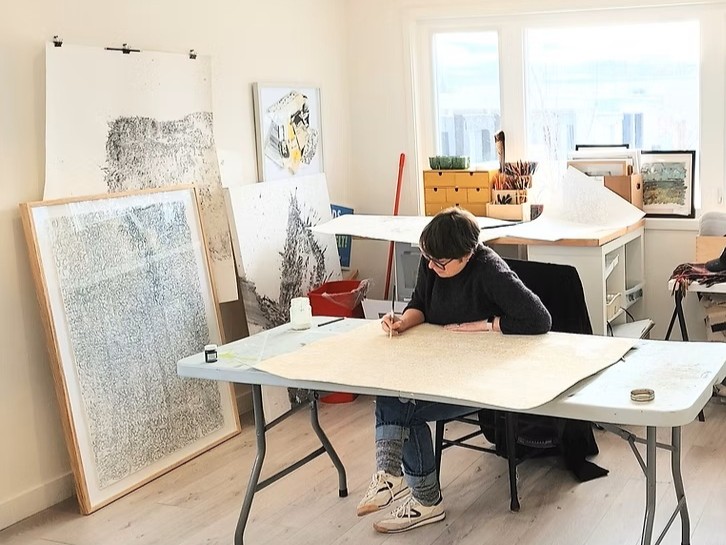
(Pictured: Jill Price, Studio 8, Barrie, Ontario. Photo by Frances Thomas.)
While former Londoner Jill Price is proficient in multiple mediums, over the past four to five years, her practice has become more process than outcome-based.
She is increasingly interested in the history and agency of materials and has come to realize how the visual arts may perpetuate the environmental harms that have preoccupied her work since 2010.
She gained understanding of the material excess and waste of the global fine art market through her research into the global fast-fashion industry while earning her MFA at OCADU. She recalls, “I was able to make connections between the two industries as well as became more informed about the proliferation of international art fairs, biennales, mass-produced art paraphernalia and the abundance of waste produced just in mounting one season of exhibitions at a large institution.”
As a result, Price seeks to “disrupt” Anthropocentric (the belief that human beings are the most important entities in the universe) perspectives.
This shift has led her to incorporate methods of unmaking and reconfiguring into her practice: she unmakes and reconfigures items that she has found, acquired, or created in the past into something new. This allows Price to put into action her concern for the planet, to repurpose materials that would otherwise contribute to Earth’s ecocide and to, hopefully, inspire others to work in more eco-ethical ways.
The list of individuals and institutions who have inspired or helped Price along the way is endless. Fortunate to have had rich educational experiences at Western, OCADU, Queens, and even during high school, she notes how she has been blessed with involvement in vibrant arts communities such as London, Barrie, Midland and Kingston, Ontario, which have led to many important friendships, mentors and business partners that have been instrumental in her professional and creative growth as an arts administrator, writer, educator, practitioner and more importantly a human.
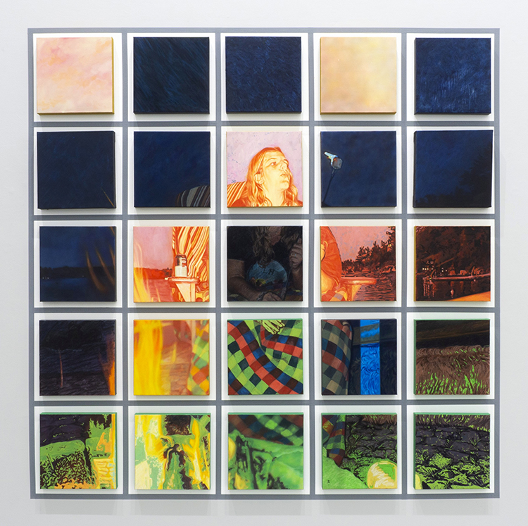
(Pictured: Jill Price, “Undoing Geography, 2026”, reconfigured paintings on canvas, pegboard, wood panels, reclaimed coloured Ikea shelves and rotating motors, various sizes. Photo courtesy of the artist.)
Price’s installation of soft sculptures, titled “Undoing Geography”, is currently on display as part of the 2026 Kellogg’s Art Competition (https://100kellogglane.com/events/art-comp-2026). Composed of deconstructed and reconfigured landscape paintings, the piece speaks to how landscapes are always in a state of flux and how everyone experiences an environment differently.
Beyond this, Price has a new body of meditative drawings emerging on top of reclaimed drop cloths and is maintaining two other long-standing projects.
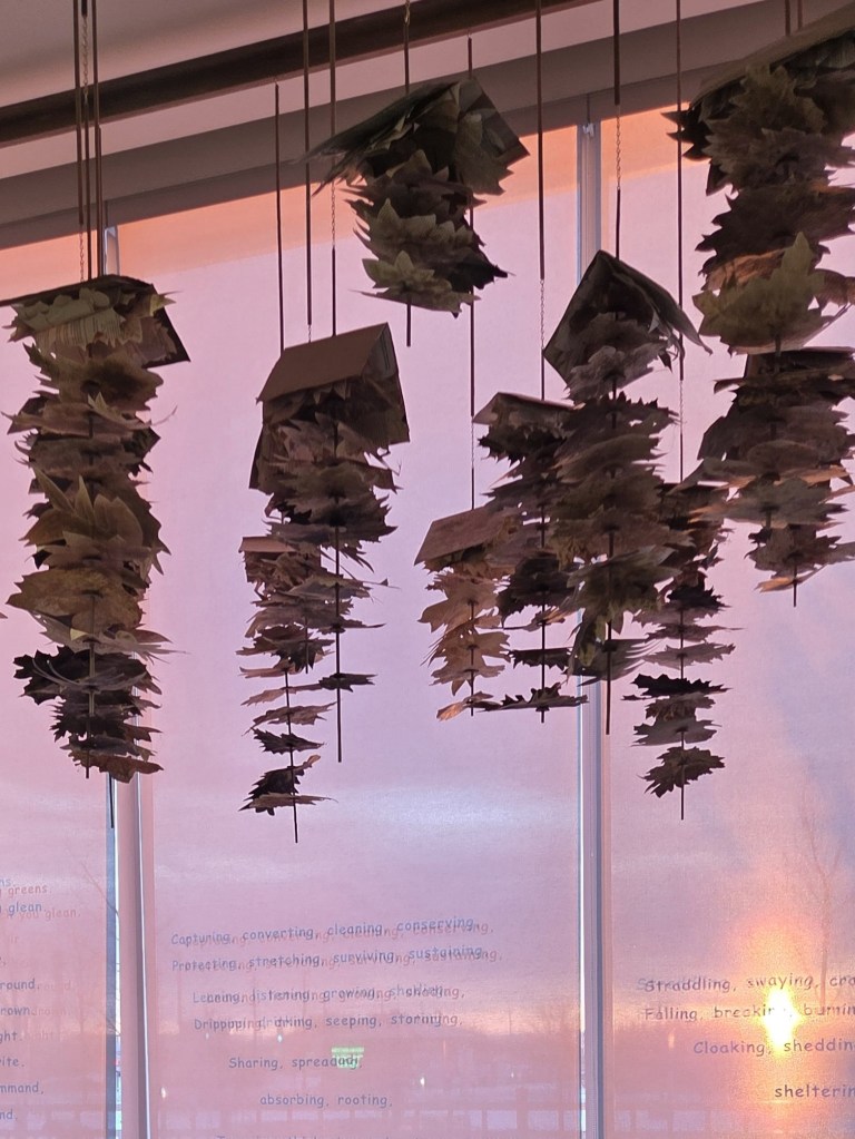
(Pictured: Jill Price, “We Are Forest, 2026”, reclaimed books, natural pigments, cardboard, poplar dowels, brass chains, wood desk, wood stool, handmade seed paper and window vinyl, various sizes. Photo courtesy of the artist.)
One is “We Are Forest”, an installation at West Gwillimbury Library, Bradford, Ontario that invites visitors to sit in the space below an assemblage of hand-dyed and hand-cut leaves constructed from old books that were slated for landfill and write a letter on hand-made seed paper on behalf of trees. Some of the letters have been planted in the library’s outdoor garden, meaning Price’s installation will long outlive the temporary exhibition of hanging paper branches.
(Pictured: Jill Price, I’ve Been Here Before”, installation shot at the Art Gallery of Mississauga. Photo by Toni Hafkenscheid.)
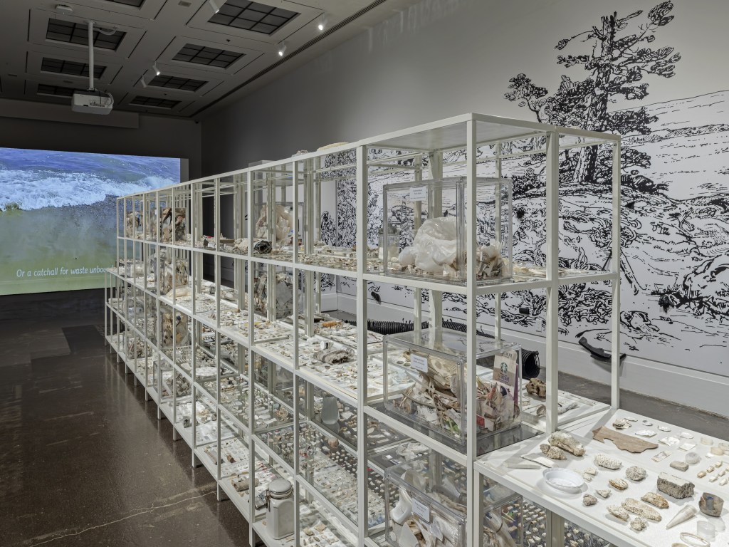
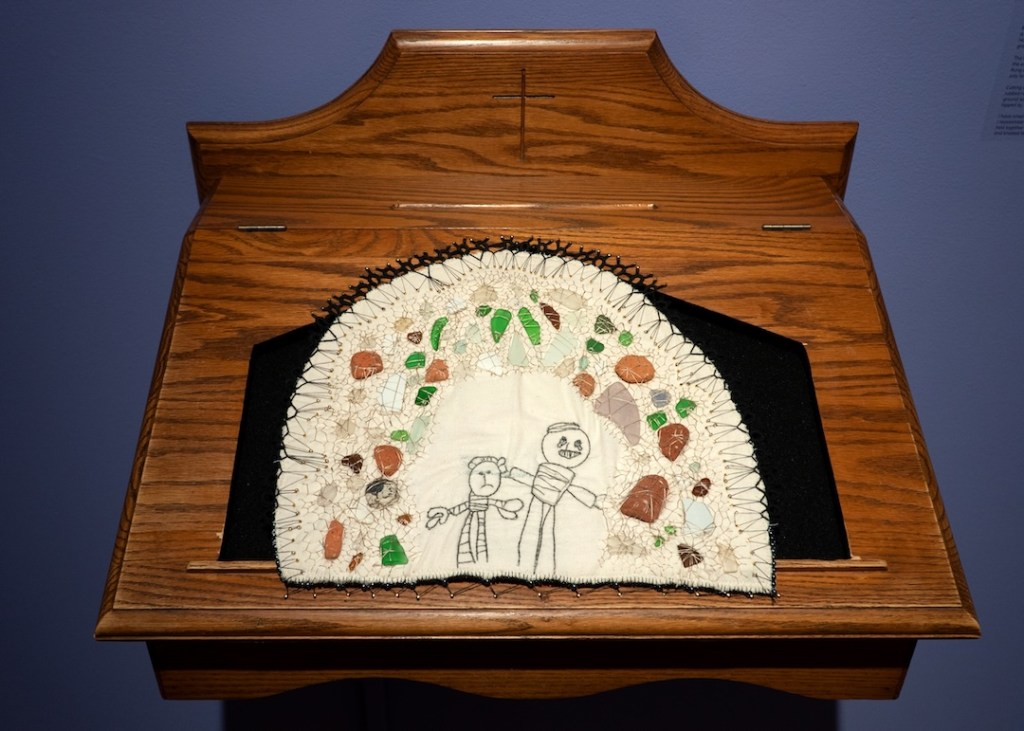
The other ongoing body of work is Price’s “I’ve Been Here Before”. Recently exhibited at the Art Gallery of Mississauga, it is comprised of museological displays of detritus garnered from regional beach cleans. As she continues to orchestrate shoreline cleanups at home and abroad, Price’s goal is to travel the installation, titled “Wht-trSH”, to different cultural centres around Lake Ontario. Learn more about this project at: https://www.artgalleryofmississauga.com/events/ive-been-here-before-cathie-jamieson-and-jill-price/
For more on Jill Price, visit http://www.jillpricestudios.ca, @jillpricestudios, or at UN/making Network Eventbrite to participate in beach cleans. People interested in how Price integrates beach cleaning walks into her drawing practice are welcome to follow her explorations on Instagram: @drawingaswalking. Cutlines:
By Beth Stewart.
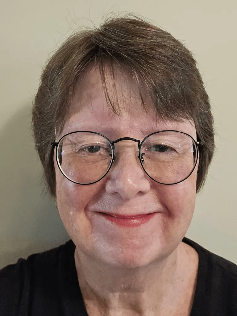
Beth Stewart is a writer, educator, and visual artist. She has a B.A. and a B.Ed. from the University of Windsor and a Diploma in Art Therapy from Western University. Beth has worked as an Art Therapist with Canadian war veterans and as a Secondary School Teacher of art and English for the TVDSB. She retired in 2024.
Beth was the arts editor at Scene Magazine from 2004 to 2006. She founded Artscape Magazine in 2006 and served as its editor until 2008. In addition, Beth wrote on the arts for Lifestyle Magazine from 2006 to 2017 and served as the copy editor for The BeatMagazine (in print) from 2009 to 2013.
As a visual artist, Beth works mainly in dry media and favours coloured pencil. Over the past decade, Beth’s focus has been on wild and domestic birds. Beth is a member of the Coloured Pencil Society of America, the Gallery Painting Group, the Eclectic Collage Collective, the Lambeth Art Association, and a founding member of the Coloured Pencil Artists of Canada group.
This is the ninth in an ongoing series in which The Beat Magazine 2025 takes readers “Behind The Scenes” to meet the talented creative individuals who make the London area such a vibrant arts and culture community.
In this segment, Beth Stewart profiles Visual Artist Cathy Horvath Buchanan.
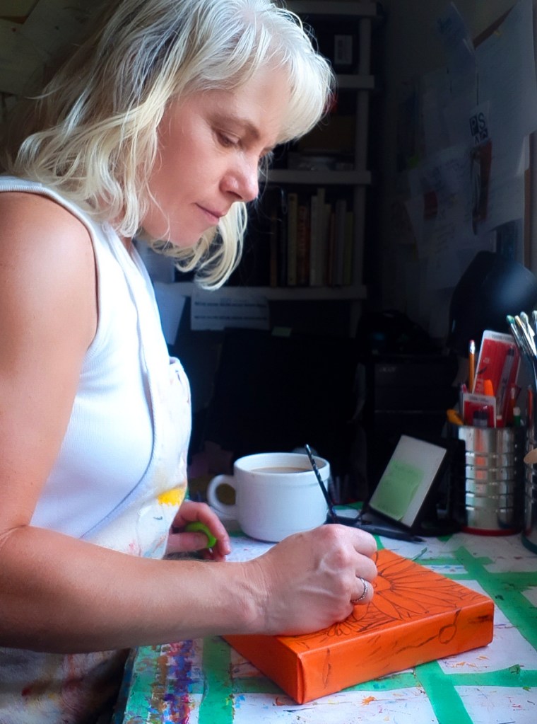
(Cathy Horvath Buchanan – the artist at work.)
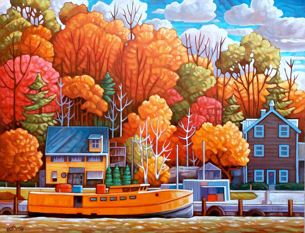
For many years, Cathy Horvath Buchanan’s paintings were constructed purely from imagination and they manifested as colourful landscapes with a folk-inspired sensibility.
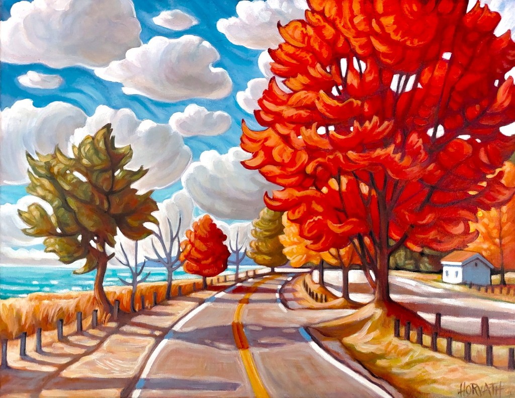
(Cathy Horvath Buchanan, “Lake Road Red Tree”, 14 by 18 inches, acrylic on canvas.)
Her current work is rooted in real-world sources. In it, she combines imagery from her plein air studies with photos from her camera roll to construct paintings. A healthy dollop of artistic licence means she still honours the colorful characteristics of her earlier work.
Horvath Buchanan explains, “The external inspiration is the starting point, but during the creation process I mutate elements in the picture, looking for ways to add colours, cast shadows, interesting lines, and use mark-making to express the dynamic mood of the view. Imagination informs most of those changes, as I freely adlib to find rhythms within the painting to accentuate the vibe of the subject.”
Horvath Buchanan is driven to create by the desire to express what she sees so she can keep it close. To commit something to canvas, she examines every aspect of her chosen subject. She says, “Once I paint something, it will always be with me.”
She makes good use of this ability to cement memory: “In the winter I paint flowers and summer landscapes because I miss and want the joy they bring me.”
Horvath Buchanan has work in local galleries, including Museum London’s gift shop, Sparta’s Gathered, Main Street Gallery in Bayfield, St. Thomas Elgin Public Art Gallery, and in venues around Port Stanley including the Art & Soul Cafe, and the Windjammer.
She is currently in the top 100 for the 2026 Kellogg’s Art Competition with “Golden Harbour Port”, a colourful acrylic on canvas painting of the Port Stanley harbour.
(Cathy Horvath Buchanan’s “Golden Harbour Port”, a 20-by-26-inch acrylic on canvas can be seen at the 2026 Kellogg’s Art Competition.)
She is looking forward to once again being in the Elgin County Studio Tour September 26 and 27. This is the perfect opportunity for art lovers to visit her Port Stanley studio.
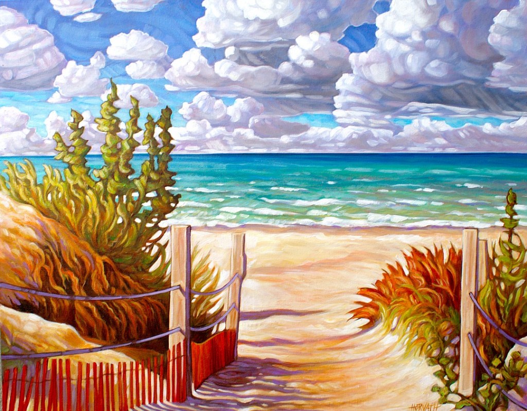
(Cathy Horvath Buchanan, “Beach Path Port Franks”, 22 by 28 inches, acrylic on canvas.)
For more information on Cathy Horvath Buchanan, and to see her online offerings of paintings, prints and more, visit her website at CathyHorvathBuchanan.com
This is the sixth in an ongoing series in which The Beat Magazine 2025 takes readers “Behind The Scenes” to meet the talented creative individuals who make the London area such a vibrant arts and culture community.
In this segment, Beth Stewart profiles Visual Artist Derek McLarty.
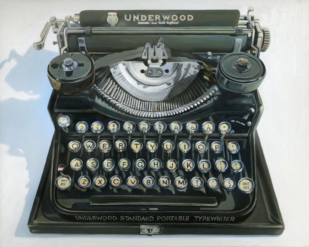
(Pictured: Derek McLarty, “Underwood”, oil on canvas, 24 by 30 inches. Image courtesy of the artist.)
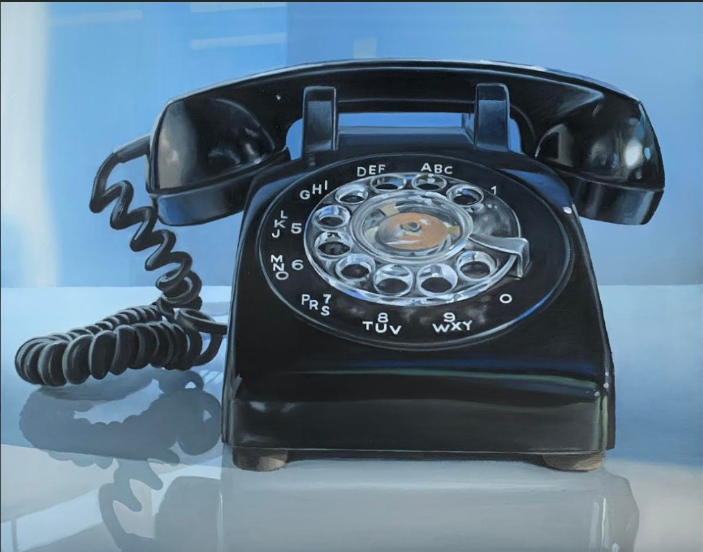
Derek McLarty paints everyday items that have acquired a certain patina as the result of their journey through time. He describes his art as a reaction to our disposable society. His subjects are often analogue objects from a time when we did not “gorge our landfills” with items whose only crime is to have fallen out of fashion. Examples are a black rotary dial phone and a quintessential Underwood typewriter.
His works evoke nostalgia as well as admonishment. He explains, “For viewers, there may be a certain nostalgia in seeing objects that they remember from childhood, but that is not my purpose. I aim to remind viewers of objects that have disappeared from everyday life to draw attention to society’s rampant consumerism.”
While he uses a representational style, he is not a slave to creating a photographic representation of his subjects. He purposely leaves visible brushstrokes and uses an “economy of marks”. He explains, “Leaving traces of the artist’s hand reminds the viewer [a painting is] human-made – rather like many of the objects represented”.
(Pictured: Derek McLarty, “Land Line version 2”, oil on canvas, 16 by 20 inches. Image courtesy of the artist.)
His drive to create is complicated. McLarty admits there is a certain satisfaction in mastering the formal aspects of painting – creating a pleasing composition, choosing colours effectively and even the craft of creating an effective illusion of reality. He also finds that painting is an effective method of communicating his dissatisfaction with society’s “addiction” to “the new, the shiny and the fashionable”.
McLarty is involved in the annual London Artists’ Studio Tour, and his work can be seen in Museum London’s shop as well as at Westland Gallery. In addition, he displays work at Marten Arts Gallery in Bayfield, in the annual Paint Ontario show, and more recently in the Summer and Grace Gallery in Oakville.
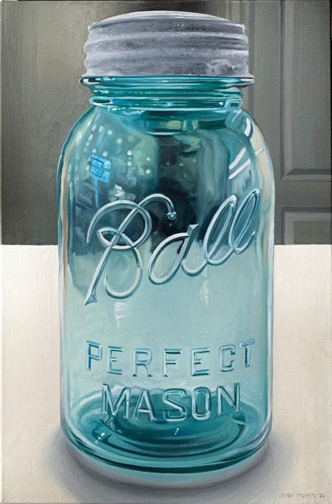
His work “Perfect Mason” is a finalist in the 2026 Kellogg’s Art Competition.
(Pictured: Derek McLarty, “Ball Mason Jar”, oil on canvas, 24 by 16 inches. Image courtesy of the artist.)
To learn more about Derek McLarty, visit www.derekmclartyart.com / Facebook: Derek McLarty / Instagram: @derekmclaryswork / Pinterest: DerekMcLartyArt
This is the third in an ongoing series in which The Beat Magazine 2025 takes readers “Behind The Scenes” to meet the talented creative individuals who make the London area such a vibrant arts and culture community.
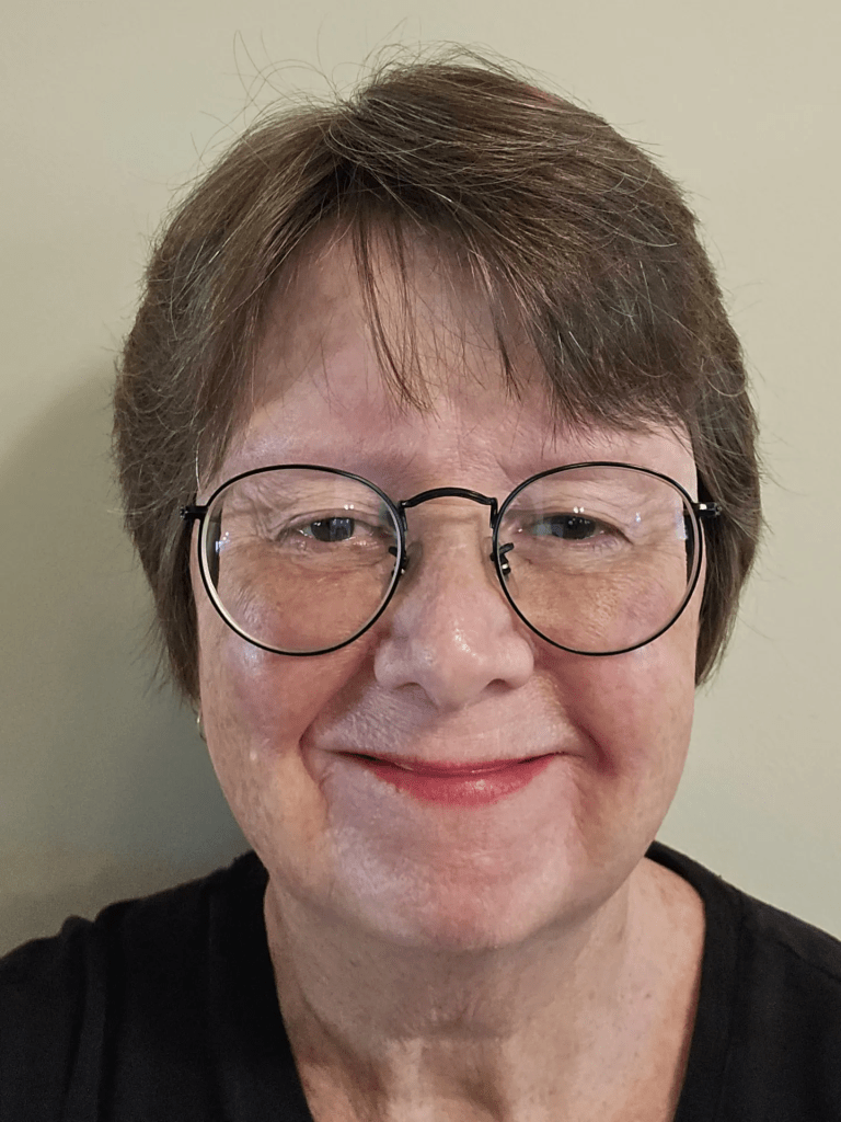
In this segment, Beth Stewart profiles visual artist Anna Wilson.
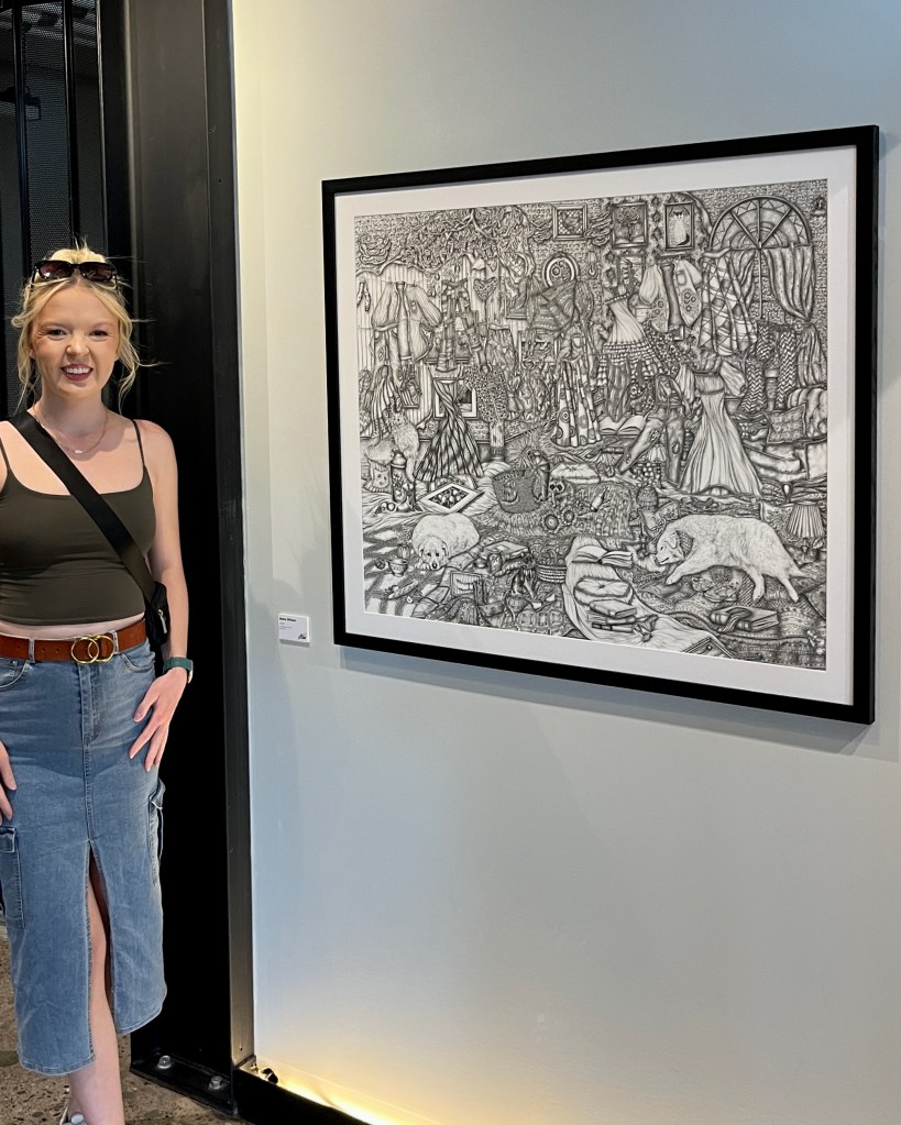
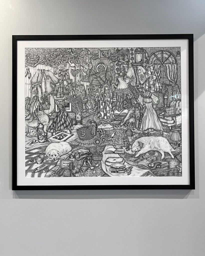
(Pictured: Anna Wilson and “Found” at 100 Kellogg. Image courtesy of the artist.)
Anna Wilson is known for her intricately detailed fineliner drawings. She describes her subject as newly imagined places, inspired by real animals, architecture, furniture, and objects.
Wilson constantly takes photographs of places and things that she finds beautiful or interesting to use for reference in her drawings. She then plays with her references until they suit her vision. She explains, “I may change the pattern of a chair’s upholstery, add in flowers bursting from walls, or perspectives that have been manipulated in impossible ways.”
The sizes of her pieces run the gamut – some as small as 8 by 8 inches, others as large as 40 by 30 inches.
Wilson has always been passionate about art. Over time, her zeal has matured into commitment as she has discovered her medium and honed her style. She credits art teachers Erica Reshef of Artventure Art Studio and Leslie Putnam of Banting Secondary School, as well as her supportive family, with inspiring her to pursue a career as an artist. Wilson subsequently graduated from Western University in 2018, where she studied visual art and psychology.
Art lovers will see a lot of Wilson’s work in the months to come. Her drawing “Found” was chosen as one of the Top 100 pieces in the 2026 Kellogg’s Art Competition.
(Pictured: Anna Wilson “Found”, fineliner on paper, 30 x 36. Image courtesy of the artist.)
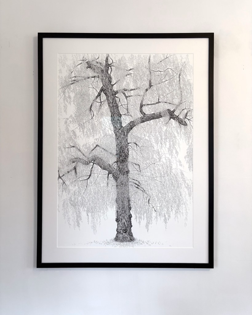
Her willow tree drawing, “Graceful,” will be in “Visual Elements 68” opening at Woodstock Art Gallery on July 11th. It’s Wilson’s first time showing in Woodstock.
(Pictured: Anna Wilson, “Graceful”, fineliner on paper, 40 x 30. Image courtesy of the artist.)
Anna is also preparing for a show at Westland Gallery, 247 Wortley Road, from August 25 to September 26. It will showcase her “Every Last Leaf” series, a new collection of highly detailed drawings of willow trees and birds, the result of her burgeoning passion for nature.
To learn more about Anna Wilson, visit www.annawilsonart.ca or check her out on Instagram/Facebook: @anna_wilson_art
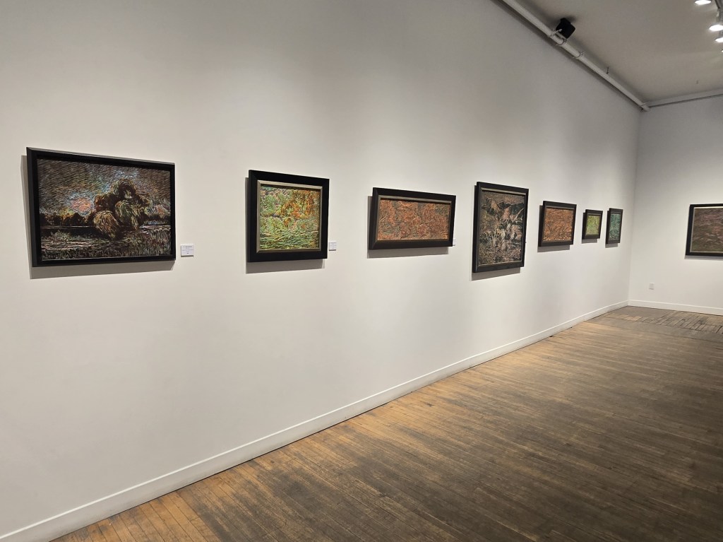
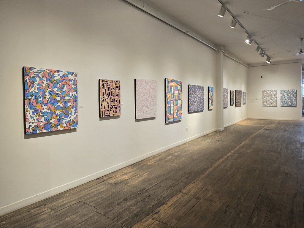
(Installation shot of the left side of the TAP Main Gallery. Photo by Beth Stewart.)
“Come As You Are” occupies the Main Gallery of TAP Centre for Creativity, 203 Dundas Street, from June 23 to July 4, 2026. An opening reception is planned on Thursday, June 25th, from 6 to 8pm with both artists in attendance.
The show juxtaposes work by Bijan Ghalehpartdaz with work by August Theodore.
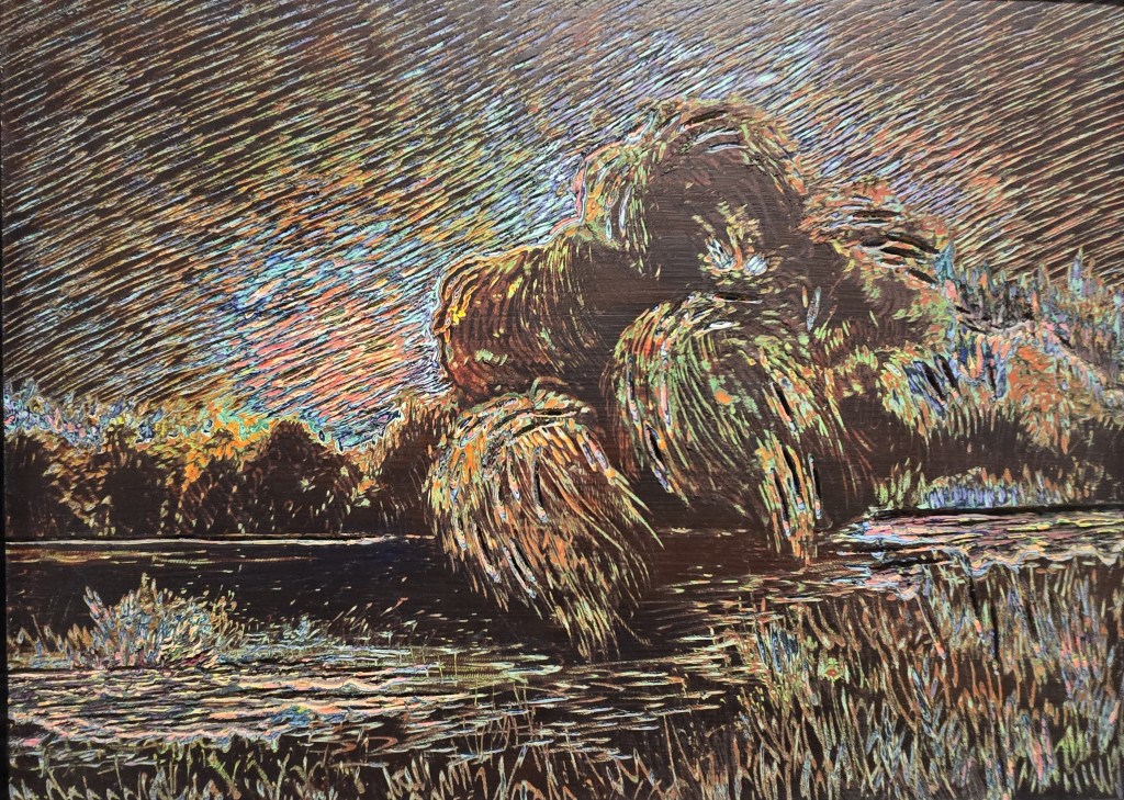
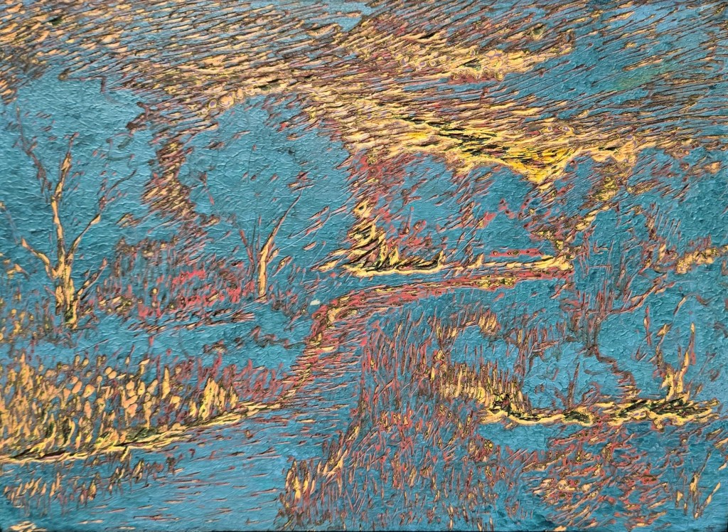
(Bijan Ghalehpartdaz, “Wild Willow” (plein air), engraved acrylic paint on board, 18 by 24 inches. Photo by Beth Stewart.)
Bijan Ghalehpartdaz needs no introduction to the local arts community. As the owner of Bijan’s Art Studio for over 30 years, a literal “candy store for artists”, he is familiar to all.
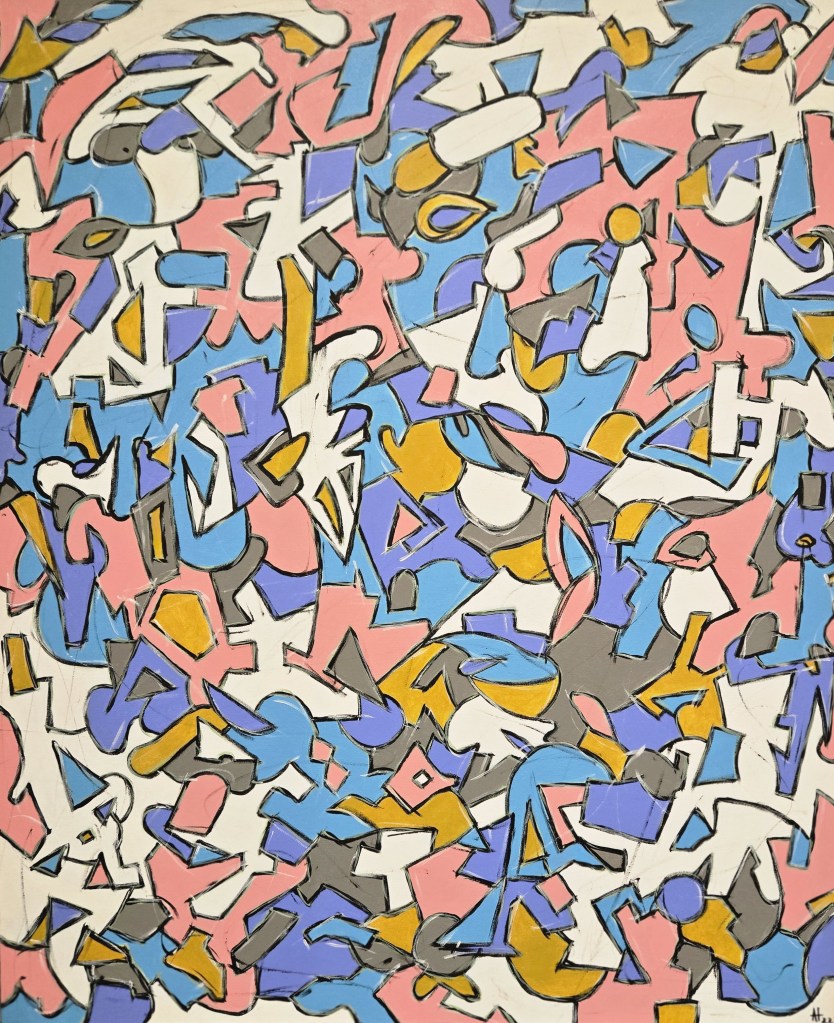
August Theodore, born in 1976 in the east end of Toronto, is a self-taught abstract painter. He relocated to the east end of London in 2016. A full-time artist, he works out of his home studio.
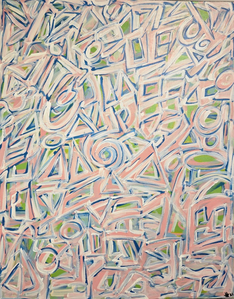
(August Theodore, “Eye Candy Modernist”, acrylic on canvas, 30 by 36 inches, 2021. Photo by Beth Stewart.)
The two met when Theodore became a customer at Ghalehpartdaz’s store.
Says Theodore, “Over the years, we had various conversations about art.” Through their mutual interest in art, the two became friends.
“About a year and a half ago, I invited Bijan to see my work. The next time I saw him, he said we should show together. I agreed, and here we are.”
Ghalehpartdaz recalls when he first visited Theodore’s studio, he was “blown away by his colours and intricate wallpaper pattern-like images.”
Ghalehpartdaz’s work follows two distinct paths. Along one, he uses layers of art resin and acrylic paint, a technique he describes as “super intense and time-consuming” but ultimately rewarding and which results in a realistic, three-dimensional painting.
(Bijan Ghalehpartdaz, “Memory of Home”, art resin and acrylic on board, 21 by 21 inches. Photo by Beth Stewart.)
Along with the others, he explores acrylic paint carving. Bijan applies up to 70 layers of thick, high-quality acrylic paint on a hard wooden surface in a process that may take up to six months. When all the layers are bone-dry, he carves into them using a Dremel power tool. The result is a one-of-a-kind three-dimensional painting.
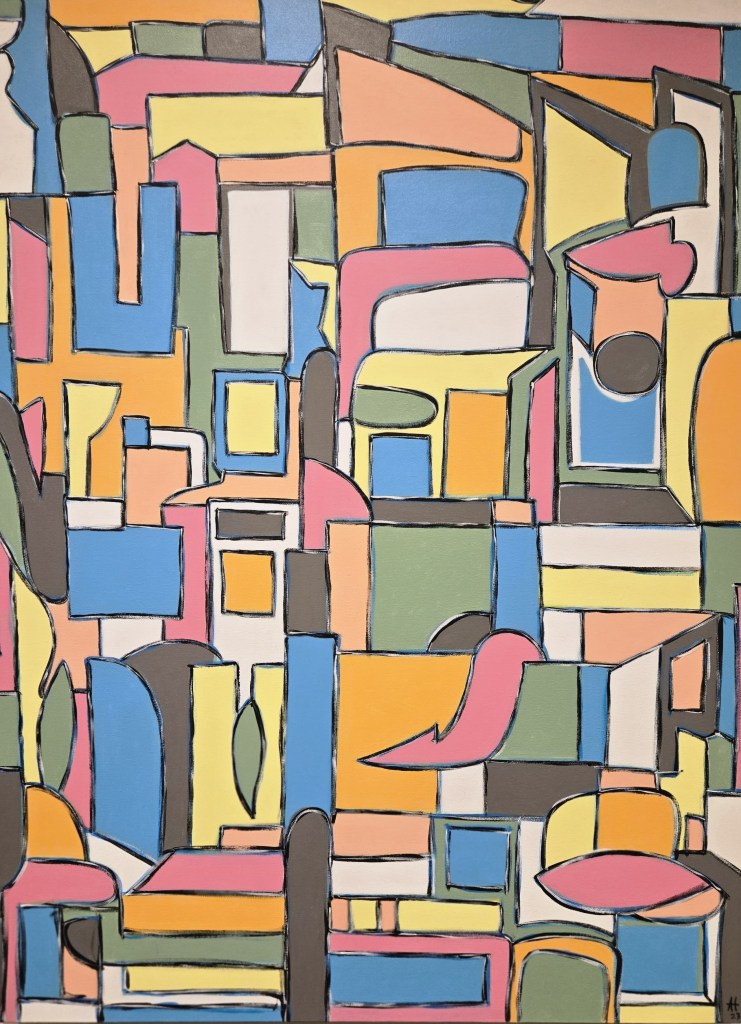
Theodore self-describes as an observer of things with roots in graffiti who draws inspiration from both nature and from urban life. Over the past three decades, his work has graced galleries, shows, markets and sidewalks across Canada and in parts of Europe.
A specific style is not his goal. Theodore says, “Mainly, I paint abstract mosaics. However, I paint different series. I’m always at play … I paint whatever I feel.”
(August Theodore, “Metropolis Stacked”, acrylic on canvas, 48 by 36 inches, 2023. Photo by Beth Stewart.)
What about the show’s title? Does it reference Nirvana’s “Come as You Are,” a song that writer Kurt Cobain purportedly said was about non-conformity and acceptance.
Does its meaning predate Cobain’s use and allude to those spontaneous gatherings popular in the 1940s to 70s, where the concept of no preparation is embraced? Or is it rooted in theology and the concept of unconditional acceptance (Whoa, Nelly. Did that just go full circle?)
Theodore says the title was indeed borrowed from Cobain. He explains, “The title refers to two artists, with different backgrounds, bringing what they do together.”
Upon entering the gallery, the dichotomy is evident and purposeful. The space is divided into two distinct exhibits; Ghalehpartdaz’s work occupies the left-hand walls, and Theodore’s the right.
(Installation shot of the right side of the TAP Gallery. Photo by Beth Stewart.)
The artists arrived at the gallery with the idea of the split, says TAP Team Member Connor Mackinnon.
When the two bodies of work are placed together, it serves to highlight their disparate physical and conceptual qualities. That, then, creates new meaning.
And it works, says Gallery attendant Bill Lee, who helped hang the show.
Ghalehpartdaz’s work is dark, moody and requires close examination. His sgraffito pieces burst with detail, texture and pattern. Their exposed underlayers glow like gold. This can be readily seen in “Harmony in Turquoise.”
(Bijan Ghalehpartdaz, “Harmony in Turquoise”, engraved acrylic paint on board, 11 by 14 inches. Photo by Beth Stewart.)
Ghalehpartdaz’s pieces have a timeless elegance and speak to an appreciation for history and quality. They sport frames that, while not ornate, are heavy and formal in appearance. His art resin pieces appear to be topped with glass (they’re not).
In contrast, Theodore’s work is bright and permits distance. He eschews representation to emphasize colour, composition and emotion. “Watermelon,” which graces the half-rotunda on the theatre level, is all about colour and form. It dazzles and then drags the viewer’s eye on a carousel-like journey.
(August Theodore, “Watermelon”, acrylic on canvas, 38 by 22 inches, 2021. Photo by Beth Stewart.)
Theodore’s pieces have a minimalist vibe and are appropriately left unframed.
Ghalehpartdaz’s pieces present the sublime power of nature. Theodore’s pieces are decidedly contemporary. Most of Ghalehpartdaz’s pieces are recent (Where does he find the time?); Theodore’s include a bevy of earlier pieces.
So, what connects their work? Theodore says it is the sheer passion they both have for what they do.
Beth Stewart is a writer, educator, and visual artist. She has a B.A. and a B.Ed. from the University of Windsor and a Diploma in Art Therapy from Western University. Beth has worked as an Art Therapist with Canadian war veterans and as a Secondary School Teacher of art and English for the TVDSB. She retired in 2024.
Beth was the arts editor at Scene Magazine from 2004 to 2006. She founded Artscape Magazine in 2006 and served as its editor until 2008. In addition, Beth wrote on the arts for Lifestyle Magazine from 2006 to 2017 and served as the copy editor for The Beat (in print) from 2009 to 2013.
As a visual artist, Beth works mainly in dry media and favours coloured pencil. Over the past decade, Beth’s focus has been on wild and domestic birds. Beth is a member of the Coloured Pencil Society of America, the Gallery Painting Group, the Eclectic Collage Collective, the Lambeth Art Association, and a founding member of the Coloured Pencil Artists of Canada group.
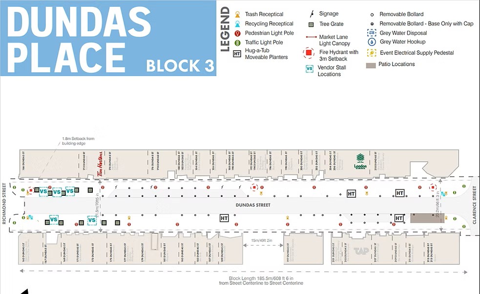
Kick off the month with a Community Art Crawl on Thursday, June 4, 2026. From 6 to 9pm, art lovers can discover makers, creators, and performers all along Dundas Place (between Richmond and Clarence streets).
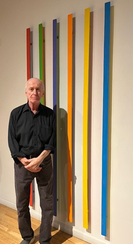
(Doug Mitchell in front of “Ambient Sticks”, acrylic on basswood, 2012. Photo courtesy of Michael Gibson Gallery.)
In conjunction with Art Crawl, Doug Mitchell is doing an Artist Talk at Michael Gibson Gallery, 157 Carling St, from 7-8pm on his Recent Works show. The London, Ontario, artist works in painting, sculpture, sound, and photography. His current pieces investigate the colour spectrum and were influenced by his extended observation of light reflecting through prisms in his studio. Also on display is Mitchell’s multi-panelled “map” of the forks of the Thames River in which he layers images, maps, and text. Recent Works is at MGG until June 26. For more info, visit: http://www.gibsongallery.com/
Art Crawl is a recurring event on the first Thursday of the month, from April to November. If you are an artist who is interested in participating, visit https://www.tapcreativity.org/community-art-crawl for guidelines. There is no cost to participate and no registration required.
Museum London’s Summer Launch Party, 421 Ridout St. N., is on June 11, 2026, from 7 to 10pm. At this pay-what-you-can at the door event, visitors can explore all three floors of the Museum, meet featured and visiting artists and curators, and dive into some hands-on creative activities. There will be food, a cash bar, and a live set with DJ Harina of OA(SIS).
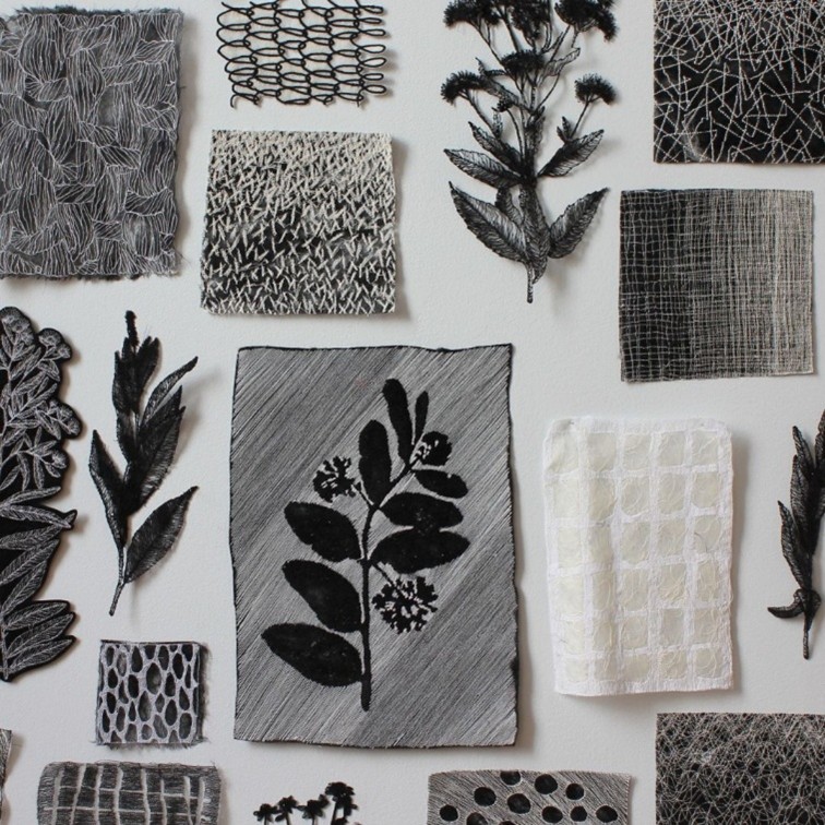
(Amanda McCavour: Double Shadow, 2025-26, thread, digital embroidery, free-motion machine embroidery, appliqué, hand stitching, nuno felting, pins. Photo courtesy of Museum London.)
While there, be sure to see Double Shadow, a site-specific installation by Toronto-based textile and embroidery artist Amanda McCavour. Bringing together more than 400 stitched elements, the installation transforms the Museum’s Atrium into a field of lace-like forms. Double Shadow continues at Museum London to March 14, 2027. For more information, visit: https://museumlondon.ca
(Poster for the Community Art Installation Project. Image from Woven into Myself (2025) by Mackenzie Daniels.)
A Community Art Installation Project featuring work by Kristi White, Mackenzie Daniels, and Mike Cywink that highlights stories of Indigenous culture, history, and community takes place on June 12, 2026, from 11am to 12pm at RBC Place, 300 King Street. It includes live music and remarks from the artists and from City representatives.
Also, at RBC Place on June 12, 2026, is Murals in Motion. From 11:30am to 2pm, on the Encore Terrace, this one-of-a-kind summer lunchtime event will see four local artists transform blank boxes on wheels into vibrant murals. Watch their work unfold while enjoying lunch from local food vendors, drinks from the licensed bar, games from Downtown London, and summer beats from a guest DJ. For more information, visit: http://www.londonarts.ca
(Abel Gingerich and Mike Sloane, “Who Knew”, 2026, magazine clippings, 9 by 12 inches. Image courtesy of TAP Center for Creativity.)
The opening reception forDear Abel / Love Mike takes place at TAP Centre for Creativity, 203 Dundas St., on June 13 between 2 and 4pm. Focusing on the act of correspondence, the paintings, mixed media, and sculptures allow the public access to friendly dialogues and the inner workings of relationship building between artists.
“Able” is Abel Gingerich, a multi-disciplinary artist living and working in London, Ontario. His body of work includes paintings inspired by real-life scenes, including garbage, concert venues and liminal spaces, covering themes of consumption, self-destruction and third spaces.
“Mike” is Mike Sloane, who has published scholarly articles and book chapters on topics ranging from trash to veganism.
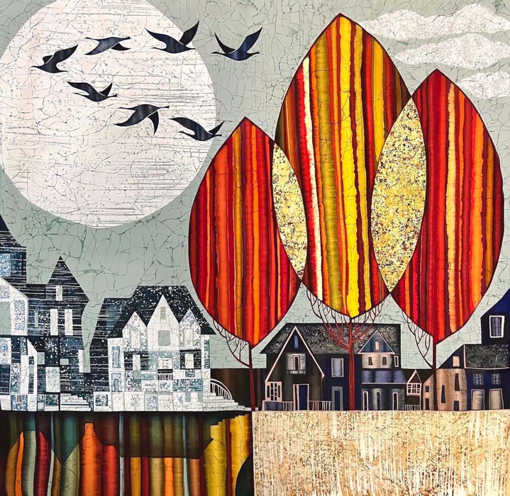
(Julia Ismambetova, “High Above I”, 30 x 30”, acrylic on silk. Image courtesy of Westland Gallery.)
Where I Like to Be with Kim Atlin, Julia Ismambetova, and Tracy Bultje continues to June 20, 2026, at Westland Gallery. This show brings together works that feature places people like to be and includes cityscapes, riverside vistas and forests.
Need more land? Westland has Made in Canada, a group show celebrating Canadian landscapes by Canadian artists, from June 23 to July 18, 2026. For more information, visit: westlandgallery.ca/
(Natasha Beaudoin, “Wordle 1,208 5/6”, oil, airbrush, chalk pastel, and oil pastel on canvas, 203 by 203 cm, 2025. Image courtesy of McIntosh Gallery.)
At McIntosh Gallery, exhibitions by Natasha Beaudoin and Eric Allan Cameron continue to July 3, 2026.
Beaudoin’s Refracted Realities demonstrates how painting can engage the emotional and psychological conditions of contemporary digital life. The exhibition draws on the visual language of historical paintings and recontextualizes it through the cultures shaped by screens and social media. Natasha Beaudoin is an MFA candidate in the Department of Visual Arts at Western University. Refracted Realities is her MFA Thesis Exhibition.
Cameron’s Distant Sunbrings together new oil paintings that distill night skies, distant horizons, and bodies of water into restrained, atmospheric compositions. Eric Allan Cameron is an MFA candidate in the Department of Visual Arts at Western University. Distant Sun is his MFA Thesis Exhibition.
For more information, visit mcintoshgallery.ca/
(Promotional image from Michelle Wilson’s Those in Glass Houses. Image courtesy of Forest City Gallery.)
Michelle Wilson’s Those in Glass Houses continues to July 23, 2026, at Forest City Gallery, 1025 Elias St. In this exhibition, Wilson investigates an unusual component of colonial rule – the greenhouse – which was a crucial tool for transporting plants and people around the globe. Collaborating with family members, Wilson merges personal anecdotes with critiques of the British empire, the trade of exotic flora, and the abduction of children. For more information, visit: https://www.forestcitygallery.com/
Beth Stewart is a writer, educator, and visual artist. She has a B.A. and a B.Ed. from the University of Windsor and a Diploma in Art Therapy from Western University. Beth has worked as an Art Therapist with Canadian war veterans and as a Secondary School Teacher of art and English for the TVDSB. She retired in 2024.
Beth was the arts editor at Scene Magazine from 2004 to 2006. She founded Artscape Magazine in 2006 and served as its editor until 2008. In addition, Beth wrote on the arts for Lifestyle Magazine from 2006 to 2017 and served as the copy editor for The Beat (in print) from 2009 to 2013.
As a visual artist, Beth works mainly in dry media and favours coloured pencil. Over the past decade, Beth’s focus has been on wild and domestic birds. Beth is a member of the Coloured Pencil Society of America, the Gallery Painting Group, the Eclectic Collage Collective, the Lambeth Art Association, and a founding member of the Coloured Pencil Artists of Canada group.
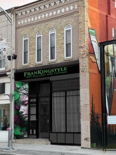
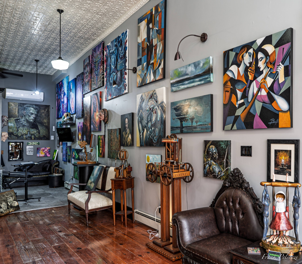
Frankingstyle Art Gallery and Tattoos, located at 632 Talbot Street in St. Thomas, self-describes as a “space where ink and imagination collide”. The gallery-tattoos combo is a place where art does more than hang on the walls. It “lives and breathes.”
(Pictured: Frankingstyle Art Gallery. Photo by Frank Pelsoczi.)
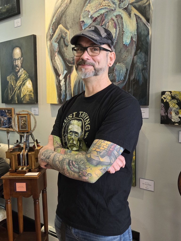
Unlike its namesake, this creation is not one to be shunned, especially by its creator, Francis Martin. It fits well into the local arts scene and offers a welcome infusion of exhibition space.
(Pictured: Francis Martin. Photo by Beth Stewart.)
I dropped by the gallery on March 27 for a sneak peek at its inaugural show. I found it to be spacious, welcoming, and chock-a-block with art of every description.
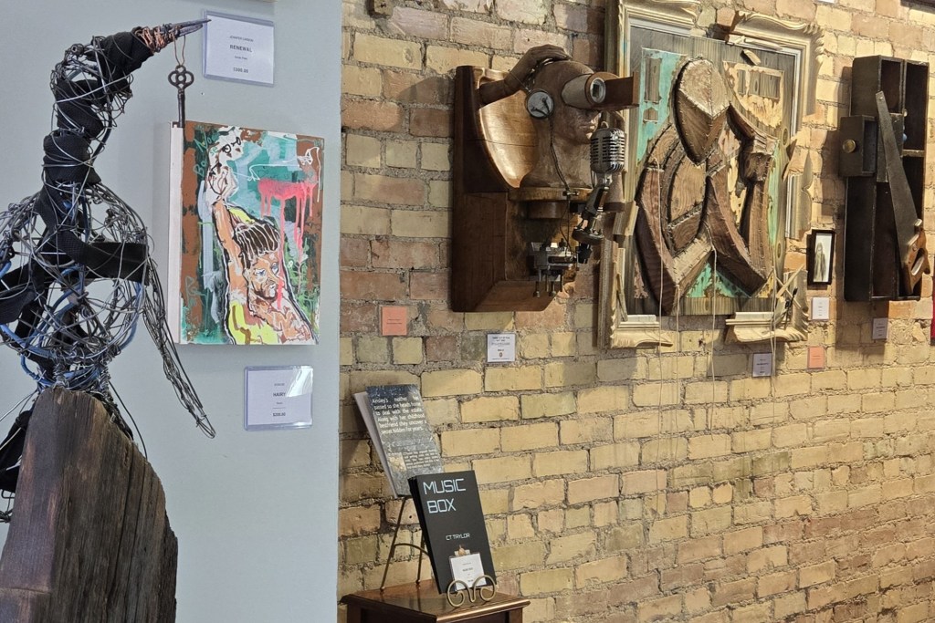
(Pictured: Installation shot of left wall. Photo by Beth Stewart.)
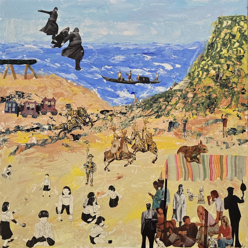
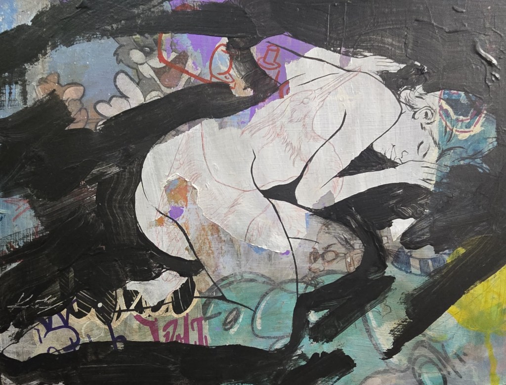
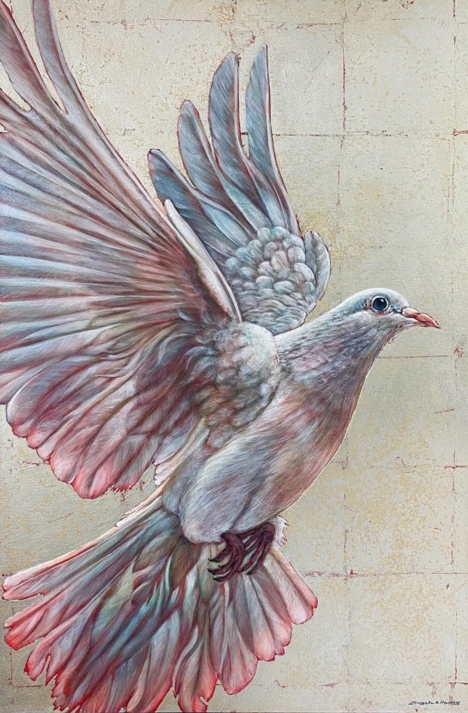
In addition to seeing pieces by Martin and his talented son Koen, I encountered work by many familiar artists – Sarah Cowling, Angela Hardy, Dennis Kalichuk, Brian Normandeau, Robert Ruby, Marijo Swick, Suzette Terry, and Laura Woermke – and enjoyed art by many other artists who were new to me.
(Pictured: Sarah Cowling, “Beside the Sea”, collage. Photo by Beth Stewart.)
Martin was raised in Elliot Lake and has been creating art in one way or another all his life. After landing in St. Thomas several years ago, he added tattooing to his creative repertoire. It complemented his art practice and gave him a steady gig. He says, “Tattooing funds the art gallery.”
(Pictured: Koen Martin, Resting Place, acrylic on wood panel. Photo by Beth Stewart.)
Martin himself works in a variety of styles, including airbrushing, but says he loves playing with texture.
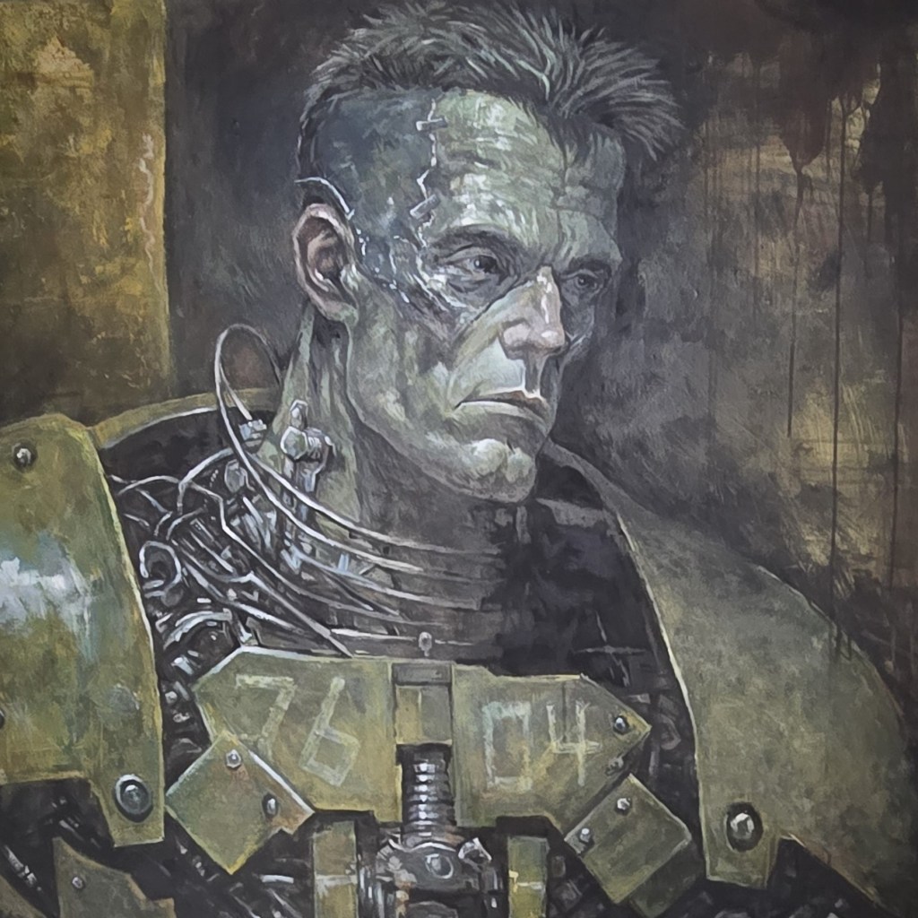
Speaking of play, Martin and his son Koen have created a hybrid persona, “Franko,” who has his own line of work. One such piece, currently on view, is the acrylic painting “Soldier of Creation Unit 76-04”.
(Pictured: “Soldier of Creation Unit 76-04” is a collaborative acrylic painting done by Martin and his son Koen working under the name “Franko”. Photo by Beth Stewart.)
Martin is an experienced teacher and, in the future, he plans to offer workshops through the gallery. He says he’ll likely focus on drawing and mixed media.
Other works and artists on exhibit include:
(Pictured: Angela Hardy, “Ignited. Come As You Are,” acrylic with silver leaf. Photo courtesy of the artist.)
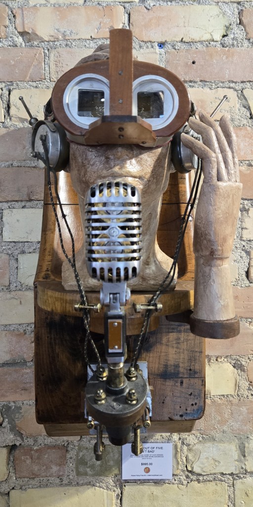
(Pictured: Robert Ruby, Three Out of Five Ain’t Bad”, assemblage. Photo by Beth Stewart.)
Beth Stewart is a writer, educator, and visual artist. She has a B.A. and a B.Ed. from the University of Windsor and a Diploma in Art Therapy from Western University. Beth has worked as an Art Therapist with Canadian war veterans and as a Secondary School Teacher of art and English for the TVDSB. She retired in 2024.
Beth was the arts editor at Scene Magazine from 2004 to 2006. She founded Artscape Magazine in 2006 and served as its editor until 2008. In addition, Beth wrote on the arts for Lifestyle Magazine from 2006 to 2017 and served as the copy editor for The Beat (in print) from 2009 to 2013.
As a visual artist, Beth works mainly in dry media and favours coloured pencil. Over the past decade, Beth’s focus has been on wild and domestic birds. Beth is a member of the Coloured Pencil Society of America, the Gallery Painting Group, the Eclectic Collage Collective, the Lambeth Art Association, and a founding member of the Coloured Pencil Artists of Canada group.
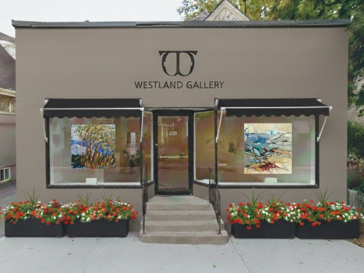
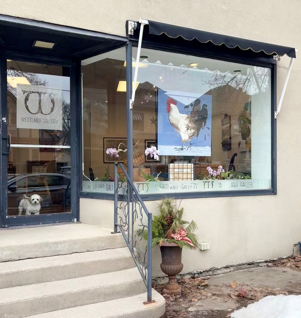
(Pictured: Designer’s rendition of exterior Westland Gallery façade. Photo courtesy of Al Stewart.)
Westland Gallery has settled into its new/old location at 247 Wortley Road. The site, once known as The Art Exchange and then Westland South, has been rechristened Westland Gallery. While the new sign has yet to go up, the old one has come down.
Located in Wortley Village, Westland Gallery offers original artwork by Canadian artists from within Ontario and mounts a new show every four to five weeks. Westland has twice been voted best art gallery in London, and this year, it won a People’s Choice Award for favourite businesses in Wortley Village.
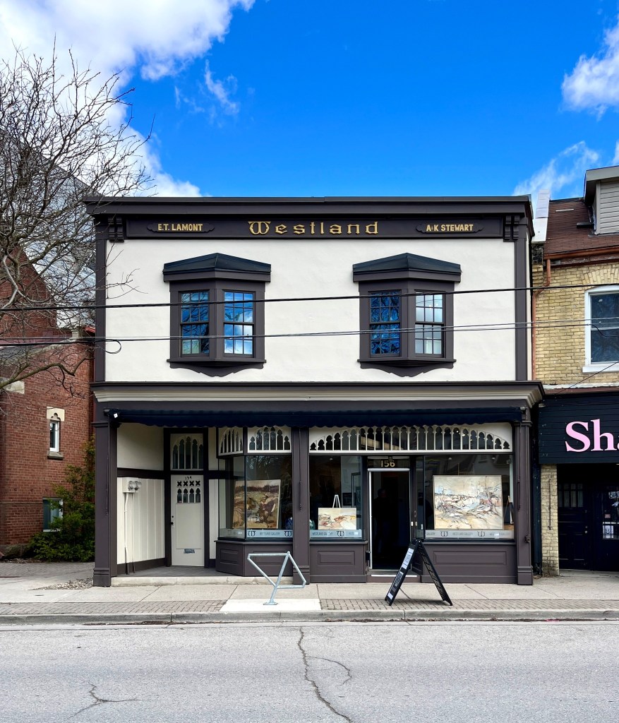
Westland Gallery came into being when, in 2007, Al Stewart’s friend Eugene Lamont asked him to be the “caretaker,” so to speak, of the latter’s historic building at 156 Wortley Road. It was just a few blocks north of Stewart’s original business, The Art Exchange.
For the next four years, the two shared the building; Lamont continued selling antiques, and Stewart began selling art at the second location.
Finally, in 2013, Westland Gallery was born. While Stewart made extensive renovations, he remained true to the building’s history.
Built in 1886, the building had housed a painting and decorating store called Westland, two pharmacies, and an antique store. The last two were owned and run by Lamont.
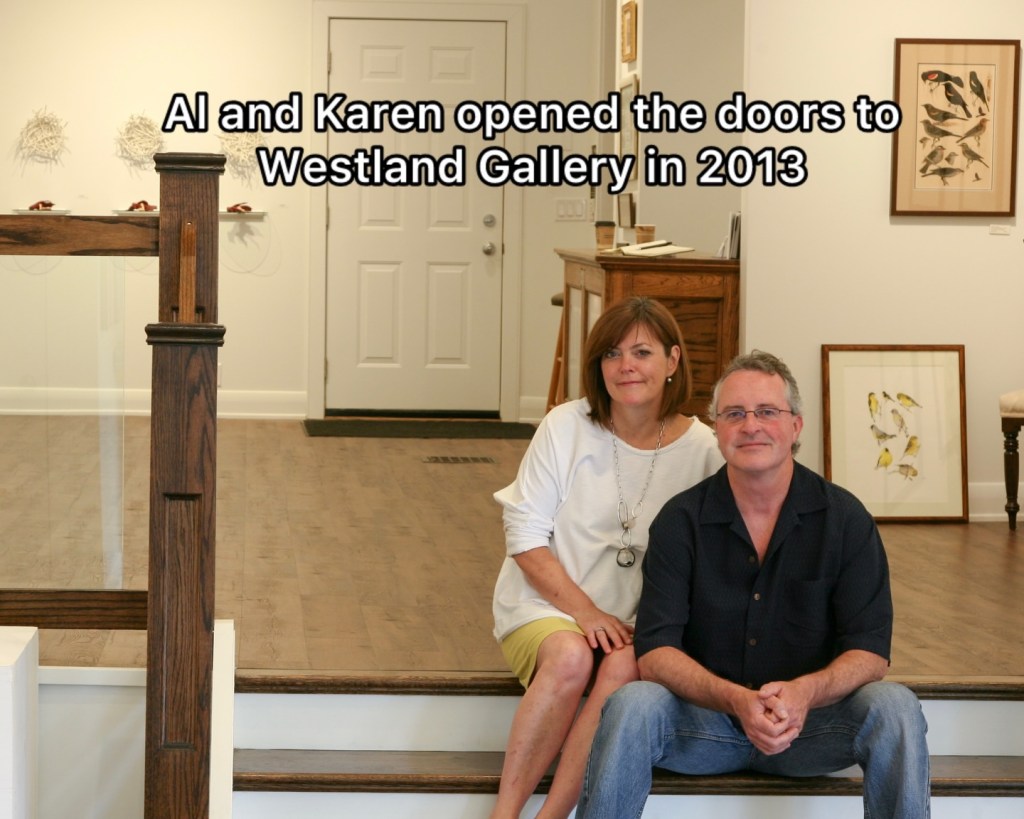
(Pictured: Westland Gallery proprietors, Karen and Al Stewart.)
Prompted by their 65th birthdays in 2025, Westland Gallery owners Al and Karen Stewart decided it was time to “dial things back.” Al Stewart says, “This is what we needed to do for ourselves at this time.”
While they were ready to let the building go, they sought a buyer who would continue to celebrate Lamont’s legacy.
Al Stewart says, “We have taken care of her, and now it is time to let someone else have the honour.”
Now, in a best-case scenario, the old building has been sold to Purdy Naturals, a storefront business that fits well into the fabric of Wortley Village.
Although the location of Westland Gallery has changed, the quality and service haven’t. Westland Gallery will still deliver exceptional artworks in a range of styles and mediums, as well as services such as art consultation and secure international shipping.
While they will miss the old building, the Stewarts are excited to have a home-based business once again.
(Photo: Courtesy of Al Stewart.)
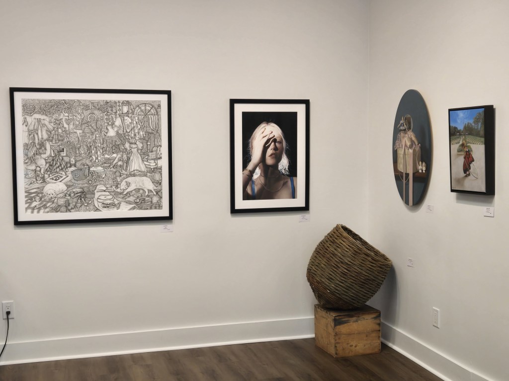
Extensive renovations have been done to 247 Wortley Road, and more are planned. Shelving has been removed. New flooring has been installed from the front of the gallery through to the back of the Stewart’s living space to create greater continuity.
(Photo: Courtesy of Al Stewart.)
The “new” location is more compressed, but Al Stewart is rising to the challenge and making use of every inch. There is less storage space, which will necessitate a faster turnover of overstock and greater website presence.
He sees it as an opportunity to put the fun back into selling art.
(Photo: Courtesy of Al Stewart.)
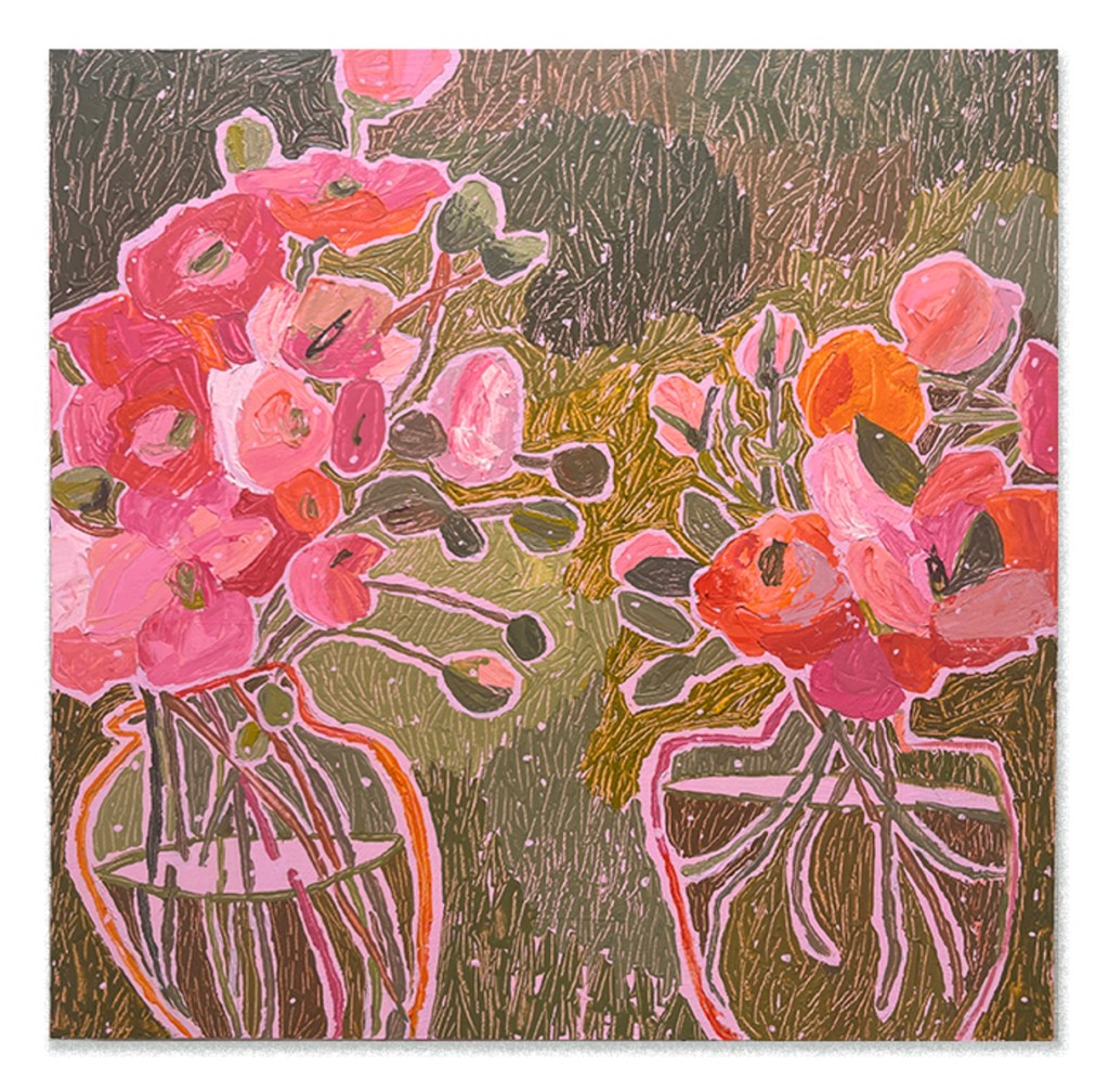
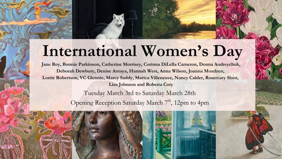
Westland Gallery’s inaugural exhibition, “International Women’s Day”, runs from March 3 to March 28, 2026 and celebrates the work of 19 female artists. The opening reception is Saturday, March 7, from 1pm to 3pm.
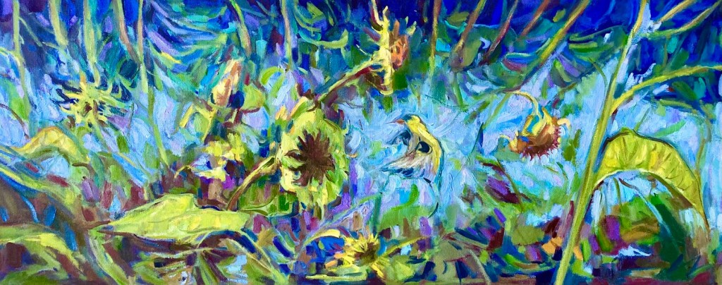
(VC Glennie, “Goldfinch,” oil on wood panel, 16 x 40 inches.)
(Marcy Saddy, “Janie Jones,” acrylic on cradled board, 20 by 20 inches.)
(Donna Andreychuk, “Falling Down”, oil on canvas, 40 by 40 inches.)
This is followed by “Pat Gibson and Nancy Moore” from March 31 to April 25, 2026, and the annual floral exhibition “Moms and Mums” from April 28 to May 23, 2026.
Westland Gallery hours are Tuesday through Friday, 10am to 5:30pm, and Saturday, 10am to 4pm. For more information, visit: https://westlandgallery.ca/
By Beth Stewart
Beth Stewart is a writer, educator, and visual artist. She has a B.A. and a B.Ed. from the University of Windsor and a Diploma in Art Therapy from Western University. Beth has worked as an Art Therapist with Canadian war veterans and as a Secondary School Teacher of art and English for the TVDSB. She retired in 2024.
Beth was the arts editor at Scene Magazine from 2004 to 2006. She founded Artscape Magazine in 2006 and served as its editor until 2008. In addition, Beth wrote on the arts for Lifestyle Magazine from 2006 to 2017 and served as the copy editor for The Beat (in print) from 2009 to 2013.
As a visual artist, Beth works mainly in dry media and favours coloured pencil. Over the past decade, Beth’s focus has been on wild and domestic birds. Beth is a member of the Coloured Pencil Society of America, the Gallery Painting Group, the Eclectic Collage Collective, the Lambeth Art Association, and a founding member of the Coloured Pencil Artists of Canada group.
The Artistry of Notion exhibition at Westland Gallery celebrates the work and friendship of Johnnene Maddison and Mike Brouse. It includes fifteen of Maddison’s colourful abstractions, as well as three of her small hand-stitched gems, and fifteen of Brouse’s expressionistic pieces.
Maddison’s acrylic-on-canvas paintings fill the front gallery, while Brouse’s oils are spread throughout the rear gallery.
Johnnene Maddison’s delightful pieces preserve small points in time in paint and form.
In her artist statement, she writes about how her subject matter and choice of media has evolved over the years from mixed media work about women – their rights, their history, their challenges – to single-media acrylic paintings that are gestural and immediate.
This work is personal yet also presents Maddison’s experiences as universal truths.
The pieces burst with colour and carefully constructed forms. While the pieces stand on their own, the titles guide the viewer’s observations and direct their thoughts.
(Pictured: Johnnene Maddison, “Doors and Windows”, acrylic on canvas, 36 by 36 inches.)
Her 36-by-36-inch acrylic on canvas “Doors and Windows” rightfully occupies the front window. The subject can be enjoyed as is, but can also be seen as a representation of transitional thresholds.
(Pictured: Johnnene Maddison, “Wandering in My Mind”, acrylic on canvas. 30 by 40 inches.
Upon entering the gallery, her 30-by-40-inch acrylic on canvas, “Wandering in My Mind”, graces the left wall with its cadmium yellow centre clamouring for attention. Another eye-catcher, her 30-by-40-inch acrylic titled “Crazy Trip”, hangs on the back wall. Both embrace angular forms that straddle a line between staticity and busyness.
(Pictured: Johnnene Maddison, “Crazy Trip”, acrylic on canvas, 30 by 40 inches.)
While Maddison boasts a well-established artistic career, Michael Brouse came late to art after taking a class just before retirement. Around 2010, he began painting landscapes, but says he soon became “excited about the distortions caused by waves on reflections [and] segued into expressive abstraction”.
He cites Maddison and American expressionist painter Krista Harris, whose work is rooted in the natural world, as having influenced his work.
His works have an ethereal quality. As with Maddison’s work, titles are important
His layered, scratched, and scraped surfaces suggest landforms and figures, yet these remain elusive. His brushwork is ragged and energetic.
To Brouse, a notion as reflected in the title of this show refers to “an intuition, a feeling, imagination.” Fitting, as his expressive application of paint on a canvas conveys memory and dreams.
(Pictured: Michael Brouse, “Stillness”, oil on canvas, 36 by 48 inches.)
For example, he says his oil on canvas “Stillness”, which hangs on the left wall with its pops of orange, captures a vivid feeling from his childhood. It is one he has also marked with a poem: “Barefoot I stepped/ on to a cold winter floor/ as a child, touched by the/ radiant magic of a breaking morn./ My secret treasure stored away/ in the stillness.”
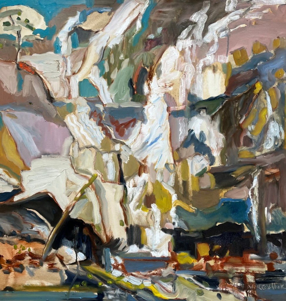
(Pictured: Michael Brouse, “North Shore”, oil on panel, 24 by 30 inches.)
On the right wall, Brouse’s 24-by-30-inch “North Shore” is next to the 32-by-40-inch “Notion”. While the subject of “North Shore” remains slippery, it contains forms that come tantalizingly close to representational, making it all the more intriguing.
One can assume its neighbour, “Notion”, is the source of the show’s title.
(Pictured: Michael Brouse, “Notion”, oil on canvas, 32 by 40 inches.)
IF YOU GO:
What: The Artistry of Notion featuring works by Johnnene Maddison and Mike Brouse.
When: February 3 to February 28. Opening Reception on Saturday, February 7, from 1:00 to 3:00pm.
Where: Westland Gallery, 156 Wortley Road, London, ON,