Reviewed by Beth Stewart
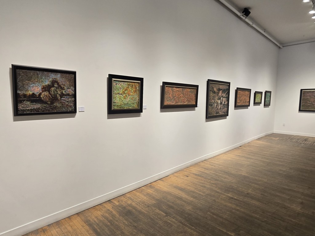
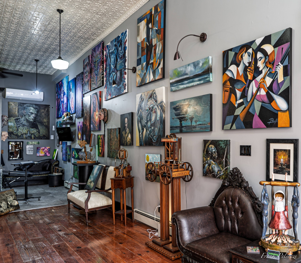
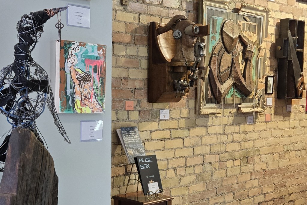
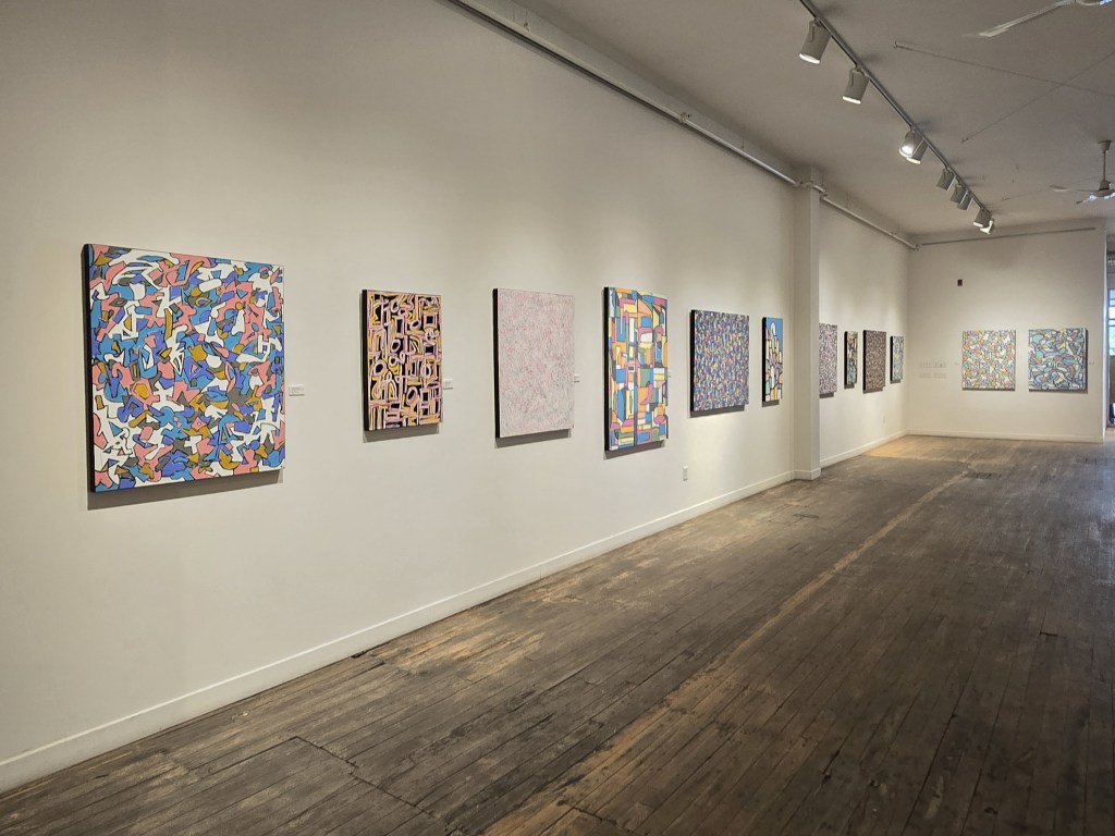
(Installation shot of the left side of the TAP Main Gallery. Photo by Beth Stewart.)
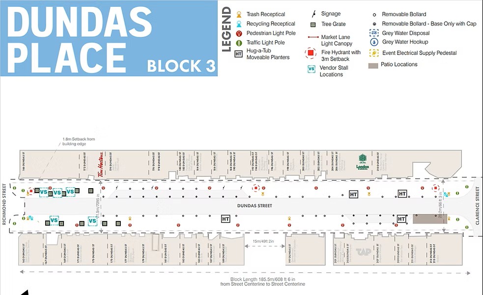
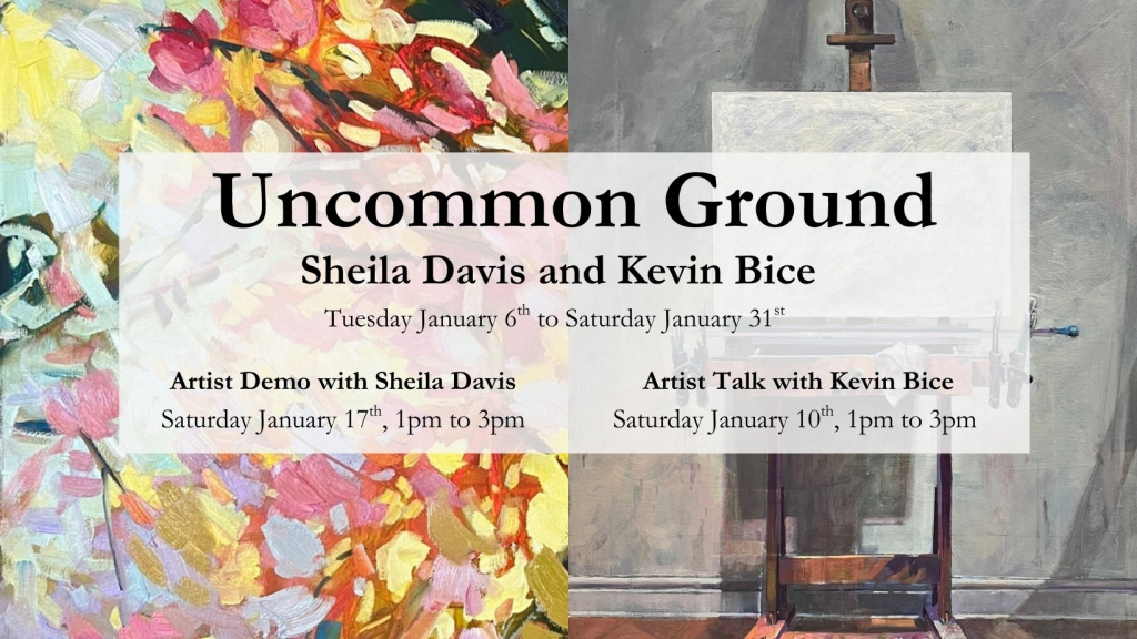
“Come As You Are” occupies the Main Gallery of TAP Centre for Creativity, 203 Dundas Street, from June 23 to July 4, 2026. An opening reception is planned on Thursday, June 25th, from 6 to 8pm with both artists in attendance.
The show juxtaposes work by Bijan Ghalehpartdaz with work by August Theodore.
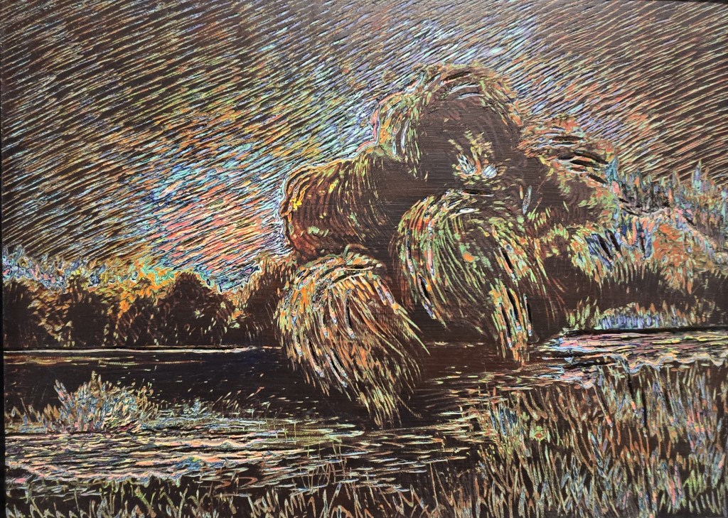
(Bijan Ghalehpartdaz, “Wild Willow” (plein air), engraved acrylic paint on board, 18 by 24 inches. Photo by Beth Stewart.)
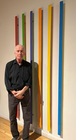
Bijan Ghalehpartdaz needs no introduction to the local arts community. As the owner of Bijan’s Art Studio for over 30 years, a literal “candy store for artists”, he is familiar to all.
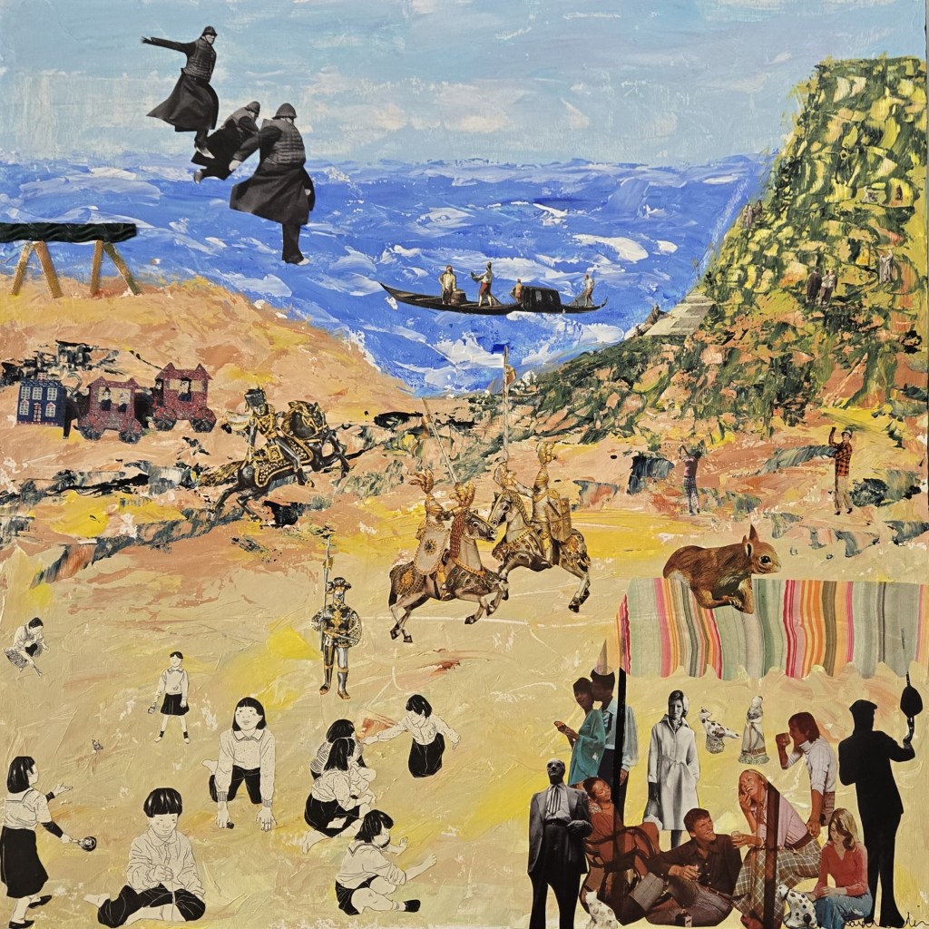
August Theodore, born in 1976 in the east end of Toronto, is a self-taught abstract painter. He relocated to the east end of London in 2016. A full-time artist, he works out of his home studio.
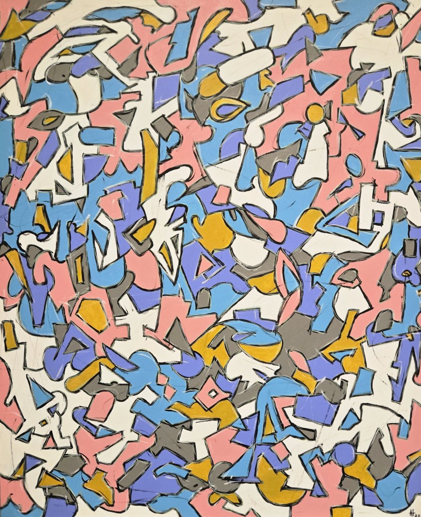
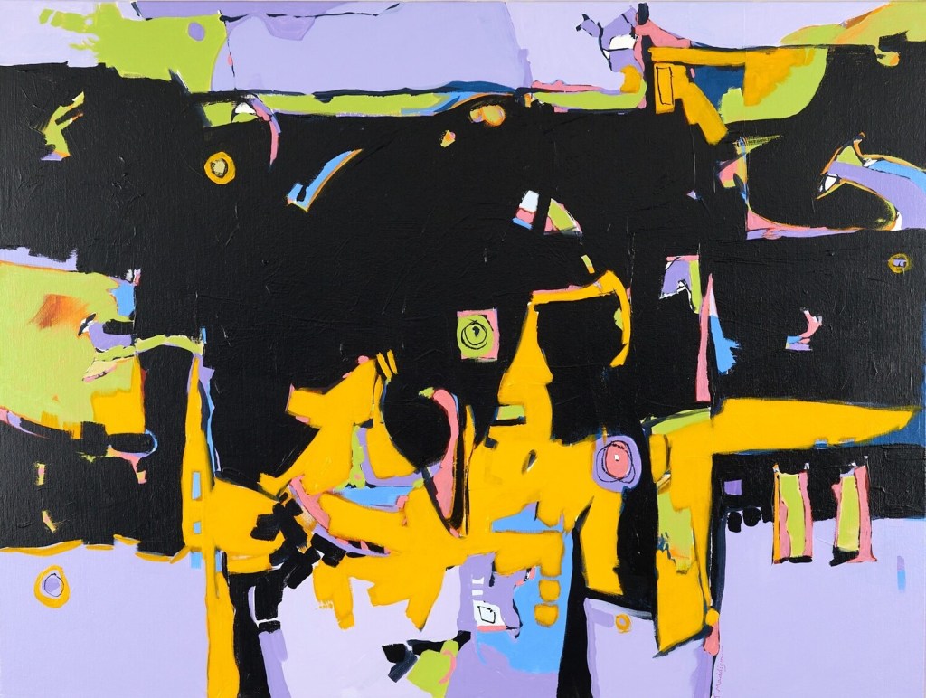
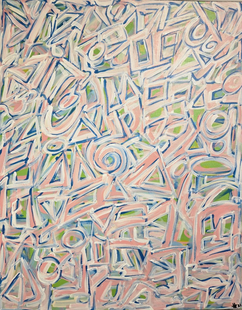
(August Theodore, “Eye Candy Modernist”, acrylic on canvas, 30 by 36 inches, 2021. Photo by Beth Stewart.)
The two met when Theodore became a customer at Ghalehpartdaz’s store.
Says Theodore, “Over the years, we had various conversations about art.” Through their mutual interest in art, the two became friends.
“About a year and a half ago, I invited Bijan to see my work. The next time I saw him, he said we should show together. I agreed, and here we are.”
Ghalehpartdaz recalls when he first visited Theodore’s studio, he was “blown away by his colours and intricate wallpaper pattern-like images.”
Ghalehpartdaz’s work follows two distinct paths. Along one, he uses layers of art resin and acrylic paint, a technique he describes as “super intense and time-consuming” but ultimately rewarding and which results in a realistic, three-dimensional painting.
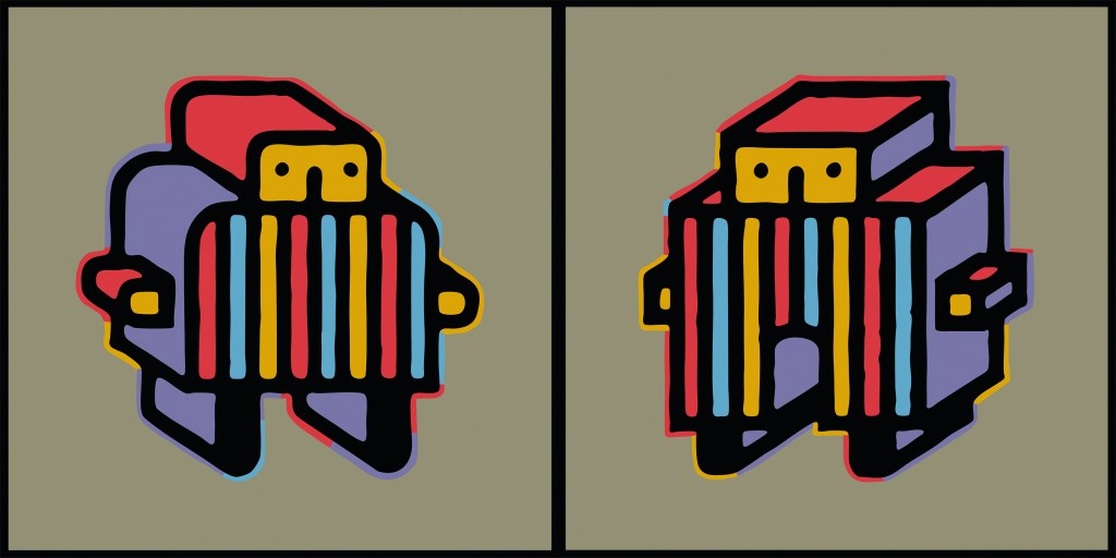
(Bijan Ghalehpartdaz, “Memory of Home”, art resin and acrylic on board, 21 by 21 inches. Photo by Beth Stewart.)
Along with the others, he explores acrylic paint carving. Bijan applies up to 70 layers of thick, high-quality acrylic paint on a hard wooden surface in a process that may take up to six months. When all the layers are bone-dry, he carves into them using a Dremel power tool. The result is a one-of-a-kind three-dimensional painting.
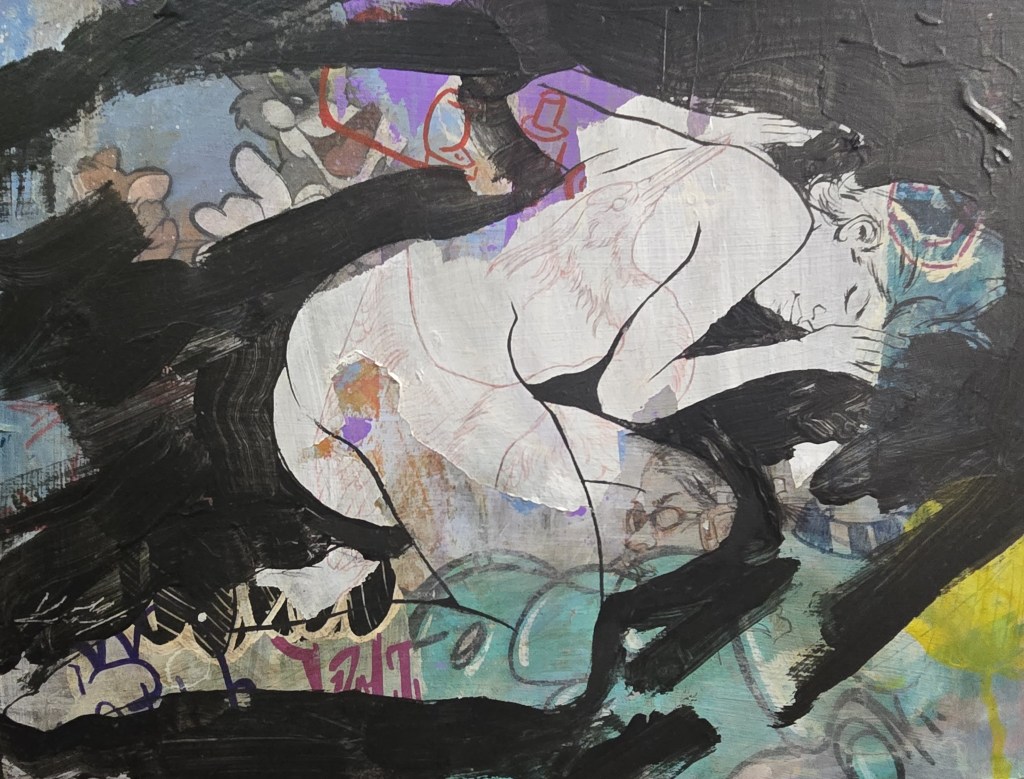
Theodore self-describes as an observer of things with roots in graffiti who draws inspiration from both nature and from urban life. Over the past three decades, his work has graced galleries, shows, markets and sidewalks across Canada and in parts of Europe.
A specific style is not his goal. Theodore says, “Mainly, I paint abstract mosaics. However, I paint different series. I’m always at play … I paint whatever I feel.”
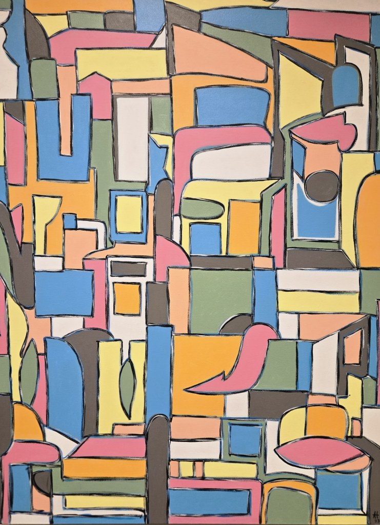
(August Theodore, “Metropolis Stacked”, acrylic on canvas, 48 by 36 inches, 2023. Photo by Beth Stewart.)
What about the show’s title? Does it reference Nirvana’s “Come as You Are,” a song that writer Kurt Cobain purportedly said was about non-conformity and acceptance.
Does its meaning predate Cobain’s use and allude to those spontaneous gatherings popular in the 1940s to 70s, where the concept of no preparation is embraced? Or is it rooted in theology and the concept of unconditional acceptance (Whoa, Nelly. Did that just go full circle?)
Theodore says the title was indeed borrowed from Cobain. He explains, “The title refers to two artists, with different backgrounds, bringing what they do together.”
Upon entering the gallery, the dichotomy is evident and purposeful. The space is divided into two distinct exhibits; Ghalehpartdaz’s work occupies the left-hand walls, and Theodore’s the right.
(Installation shot of the right side of the TAP Gallery. Photo by Beth Stewart.)
The artists arrived at the gallery with the idea of the split, says TAP Team Member Connor Mackinnon.
When the two bodies of work are placed together, it serves to highlight their disparate physical and conceptual qualities. That, then, creates new meaning.
And it works, says Gallery attendant Bill Lee, who helped hang the show.
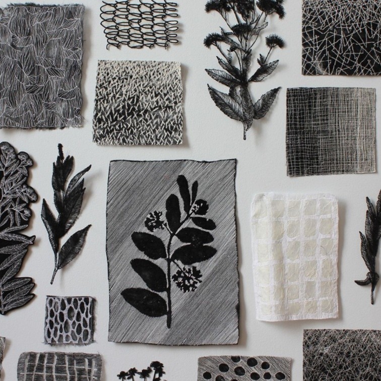
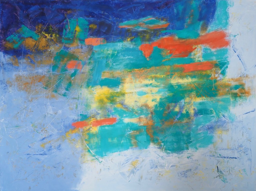
Ghalehpartdaz’s work is dark, moody and requires close examination. His sgraffito pieces burst with detail, texture and pattern. Their exposed underlayers glow like gold. This can be readily seen in “Harmony in Turquoise.”
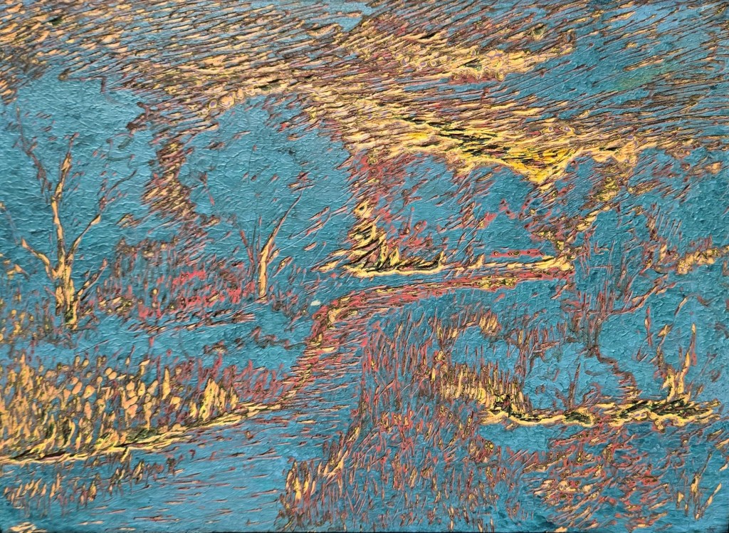
(Bijan Ghalehpartdaz, “Harmony in Turquoise”, engraved acrylic paint on board, 11 by 14 inches. Photo by Beth Stewart.)
Ghalehpartdaz’s pieces have a timeless elegance and speak to an appreciation for history and quality. They sport frames that, while not ornate, are heavy and formal in appearance. His art resin pieces appear to be topped with glass (they’re not).
In contrast, Theodore’s work is bright and permits distance. He eschews representation to emphasize colour, composition and emotion. “Watermelon,” which graces the half-rotunda on the theatre level, is all about colour and form. It dazzles and then drags the viewer’s eye on a carousel-like journey.
(August Theodore, “Watermelon”, acrylic on canvas, 38 by 22 inches, 2021. Photo by Beth Stewart.)
Theodore’s pieces have a minimalist vibe and are appropriately left unframed.
Ghalehpartdaz’s pieces present the sublime power of nature. Theodore’s pieces are decidedly contemporary. Most of Ghalehpartdaz’s pieces are recent (Where does he find the time?); Theodore’s include a bevy of earlier pieces.
So, what connects their work? Theodore says it is the sheer passion they both have for what they do.
For more information, visit https://www.tapcreativity.org/
Previewed by Beth Stewart

Beth Stewart is a writer, educator, and visual artist. She has a B.A. and a B.Ed. from the University of Windsor and a Diploma in Art Therapy from Western University. Beth has worked as an Art Therapist with Canadian war veterans and as a Secondary School Teacher of art and English for the TVDSB. She retired in 2024.
Beth was the arts editor at Scene Magazine from 2004 to 2006. She founded Artscape Magazine in 2006 and served as its editor until 2008. In addition, Beth wrote on the arts for Lifestyle Magazine from 2006 to 2017 and served as the copy editor for The Beat (in print) from 2009 to 2013.
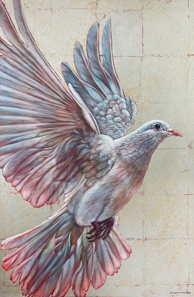
As a visual artist, Beth works mainly in dry media and favours coloured pencil. Over the past decade, Beth’s focus has been on wild and domestic birds. Beth is a member of the Coloured Pencil Society of America, the Gallery Painting Group, the Eclectic Collage Collective, the Lambeth Art Association, and a founding member of the Coloured Pencil Artists of Canada group.
Facebook: https://www.facebook.com/profile.php?id=100009620916363