This is the thirteenth in an ongoing series in which The Beat Magazine 2025 takes readers “Behind The Scenes” to meet the talented creative individuals who make the London area such a vibrant arts and culture community.
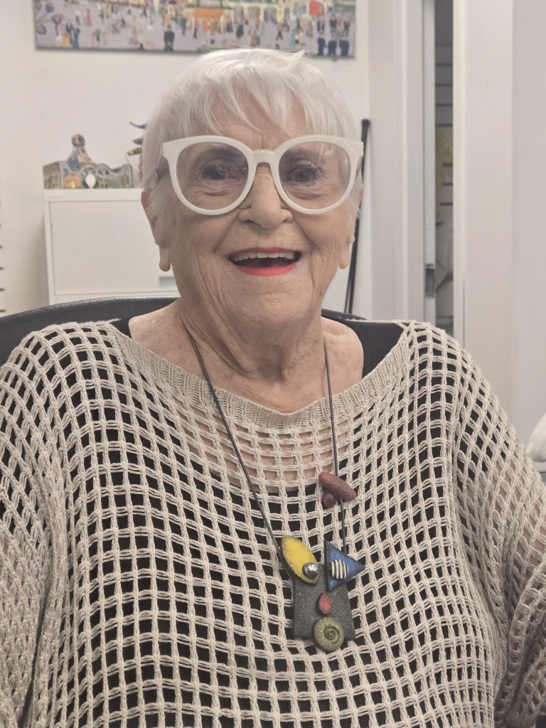
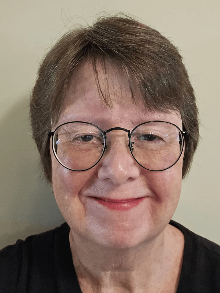
In this segment, Beth Stewart profiles Audrey Cooper, founder and owner of Art with Panache, on the eve of her 99th birthday.
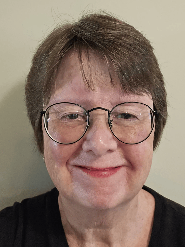
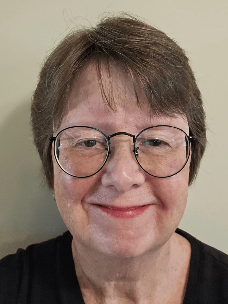
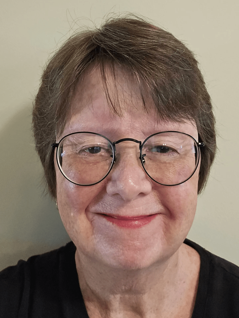
(Audrey Cooper. Photo by Beth Stewart.)
Audrey Cooper moved to London in 2003 to be closer to family and, in 2005, with little prior experience, she began painting.
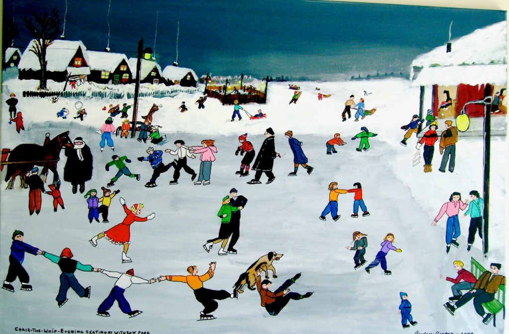
Cooper was inspired to capture in acrylic on canvas her experience of growing up in the Danforth area of Toronto in the 30s and 40s after seeing school children of this century idling during recess. She recalls, “They were standing in the school yard, on their phones, not playing games or even talking to each other.” She wanted to show how different it was when she was in school.
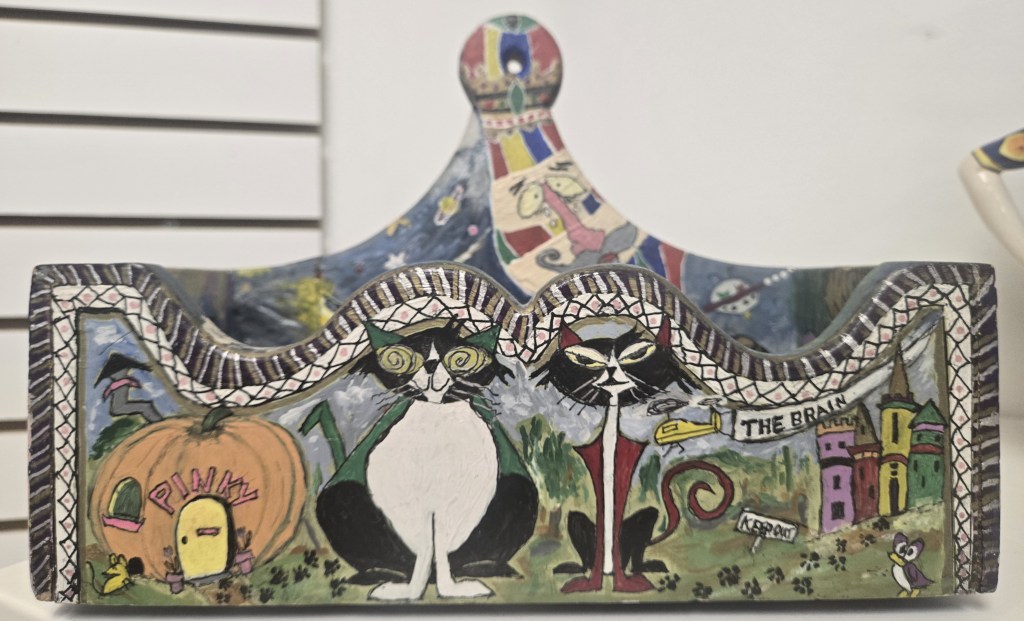
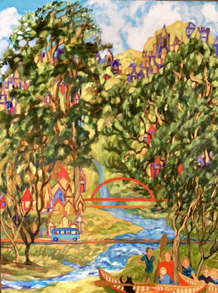
(One of Audrey Cooper’s earliest pieces. Acrylic on wood. NFS. Photo by Beth Stewart.)
“I didn’t want that time to be forgotten. We would skip double Dutch and play ball. We would play Red Rover, hopscotch, and have lots of fun,” says Cooper.
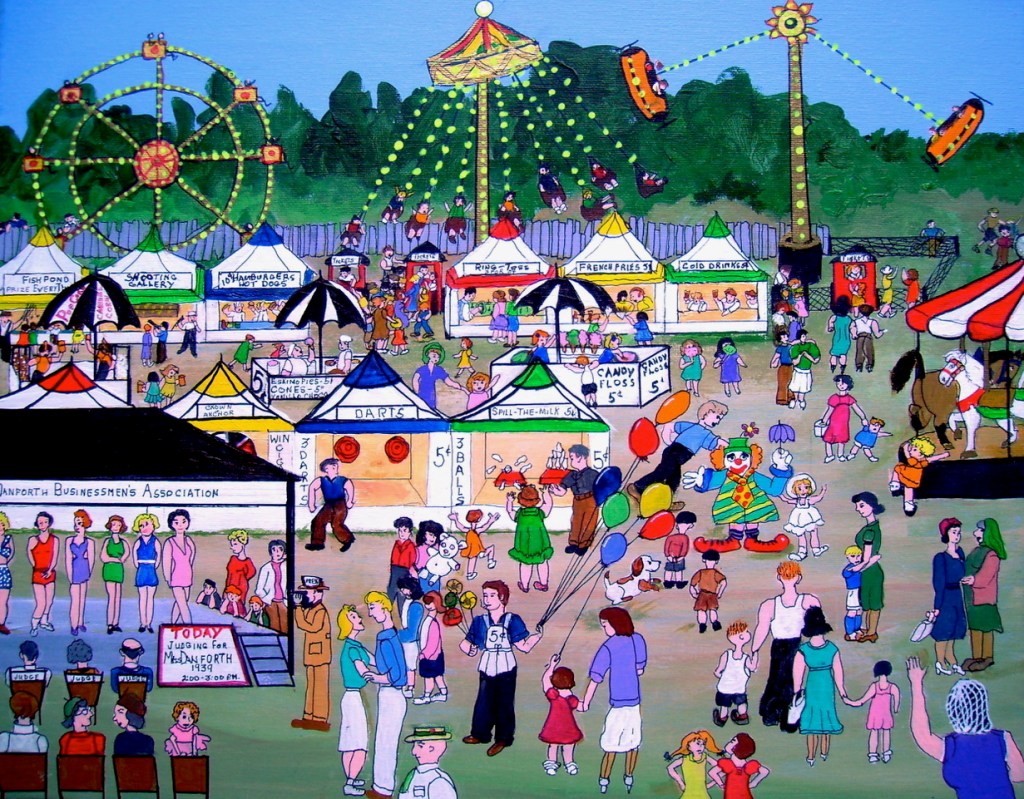
Then, she went further and showed her life from approximately nine years of age until age sixty. She captured carnivals, family outings, coffee klatches and Tupperware parties.
(Audrey Cooper’s acrylic painting “Crack the Whip (Evening Skating at Withrow Park)” depicts the park’s role as a vital winter gathering place for generations of families. Photo courtesy of Audrey Cooper.)
A self-described “city person”, Cooper classifies her own work as “Urban Folk Art”. Her vibrant cityscapes are chock-a-block with people and things. Her crowded canvases boast meticulous detail and spin rich narratives with their deeply personal mix of realism and nostalgia.
(Audrey Cooper’s acrylic painting “Carnival (Judging for Miss Danforth 1939)”, captures the excitement of small travelling carnivals that rotated through vacant east-end lots near her home. Photo courtesy of Audrey Cooper.)
Much to her surprise, Cooper discovered London did not have a gallery that would show the artworks of emerging artists such as herself.
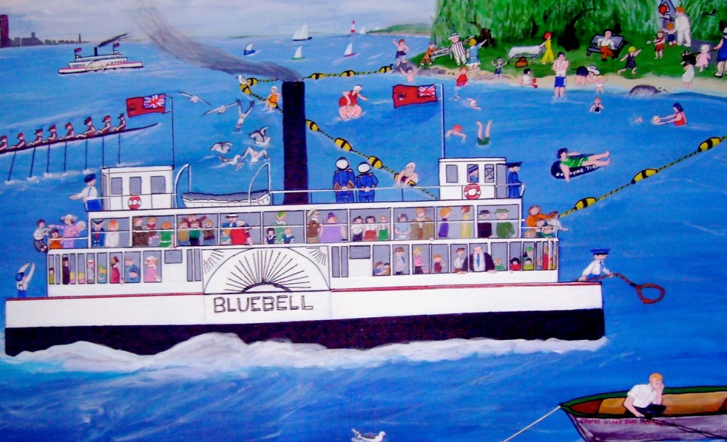
(Audrey Cooper’s 2008 acrylic painting “The Bluebell” shows the steam-powered sidewheel ferry that carried passengers between downtown Toronto and the Toronto Islands from 1906 until 1955. Photo courtesy of Audrey Cooper.)
Then, she happened upon an empty space in downtown London’s Talbot Centre and fell in love with its potential. “Its purpose was clear to me,” she says. “It was the perfect venue to show everyone what a talented and creative community of local artists we have in London”.
So, in 2013, at the age of 86, Cooper founded Art with Panache, and a dream was born.
People began to drop in, and Cooper soon recruited a roster of talented artists.
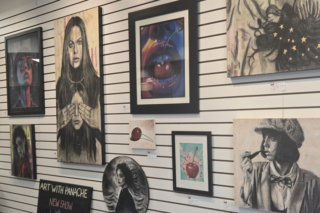
Art with Panachenow boasts 20 local artists, including owner Audrey Cooper. Member artists have input into what goes on in the gallery. They sit the gallery a minimum of two times per month. In return, they have the opportunity to show and sell their work at the venue.
(Member artists are featured on the main wall on a rotating basis. This is a selection of work by Diane Flemming. Photo courtesy of Diane Flemming.)
Member artist Dianne Fleming, who has been with the group for three years, calls the gallery “a hidden gem”.
Cooper concurs and gives kudos to all the artists who have worked in the gallery, who have brought in their collections, and who have waited patiently to be recognized by the London arts community.
(A selection pf work by member artist Catarina Bezuidenhout. Photo by Beth Stewart.)
In 2024, Audrey was named to the City of London’s Mayor’s New Year’s Honour list in the category of arts. This list celebrates the diversity of philanthropic work taking place in the London community.
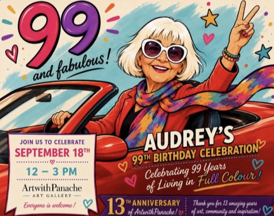
Audrey Cooper turns 99 years old on September 18, and still works in the gallery Monday through Friday. To celebrate, the gallery is planning a retrospective of Cooper’s work which will run September 14 to 18, 2026.
Cooper’s birthday coincides with the gallery’s 13th anniversary, and a party for both is planned on September 18 from 11 am to 3 pm.
Art withPanache will be putting out a Call for Artists in October. This is an opportunity for non-member artists to show their work and get a taste of what the gallery has to offer. The theme is still in flux.
This is the twelfth in an ongoing series in which The Beat Magazine 2025 takes readers “Behind The Scenes” to meet the talented creative individuals who make the London area such a vibrant arts and culture community.
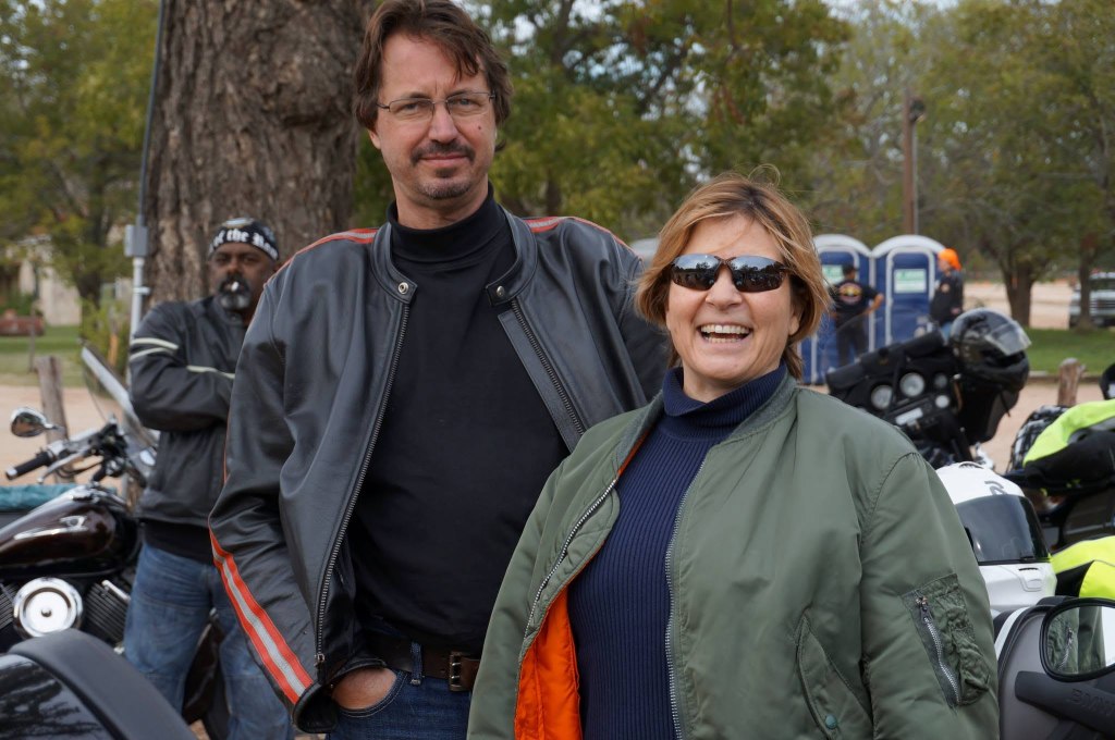
In this segment, Bob Klanac profiles Tami Kegley and Page Graham, co-founders of the popular Inside Outside recurring “salons” that bring together the music and visual art communities in a common setting.
(Pictured: Page Graham and Tami Kegley. Photo provided by Page Graham.)
It took a couple of Texas-based outsiders to spot a need in London’s cultural landscape.
Tami Kegley and Page Graham, expats 40 years living in San Antonio, Texas made their home in London a few years ago and knew they wanted to be involved in London’s growing arts and music scenes.
“When I came back, it felt like the visual arts were playing a secondary role in our community” says Kegley “and there is so much emphasis being placed upon music.
“It seemed like there was no intermingling between the visual arts and the music communities in the city.”
Graham observed in San Antonio a very vibrant arts scene intertwined with the music community.
“I really missed those wonderful artist talks. I would go to a show, and invariably there would be an artist panel discussion.”
Both Kegley and Graham came by their various passions honestly. Kegley is an acclaimed jewelry artist and Graham, a onetime CHRW 80s-era radio host had a long career in television production in San Antonio. Both were very involved in their San Antonio community and came to London looking to do the same.
“Page and I moved to London and became enchanted with the community,” Kegley explains. “We volunteered for the Close to the Edge Festival and things like that and just found ourselves wanting to be more involved.
“My career is as an artist. Page and I have both done arts journalism. That was in our tool kit, and we were looking at how we can make a positive impact on London. It occurred to us that real life conversations were important and had been left by the wayside because of COVID.
“It seems like people are more in their silos here. There are efforts that are facilitated by the city and other groups to try to break out of that but we really wanted to have an arts conversation.”
So Kegley and Graham batted some ideas around their dining room table and decided on something they would call the Inside Outside.
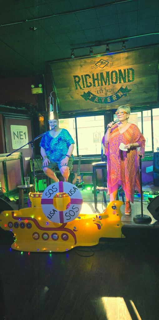
Kegley would be the host of the event interviewing the artists and Graham the producer, ensuring the music and staging goes according to plan.
It would meld music with discussions on the arts in a kind of colloquium setting with one crucial difference from other events of that type.
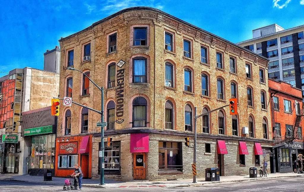
Key to the concept of the event is that it would take place in a bar, London’s legendary Richmond Tavern.
Why the gritty Richmond Tavern? To listen to Graham the answer is a resounding ‘why not’.
“It’s so cool and so real,” he says with a chuckle. “It’s like our version of the Horseshoe Tavern and that’s what makes it so special. You got the regulars in the back room around the round table, so to speak. It’s not exactly the Algonquin Hotel.
“The authenticity of that place makes it special. And that’s why, for us, it’s the venue of choice. It’s intimate. And intimacy is part of the basis of our concept.”
Kegley agrees, adding “It’s a non-intimidating space. It’s not a rarified space.”
Since it bowed in on May of 2025, Inside Outside has hosted talks by Jamie Fenton of Museum London, Graham Henderson, CEO of the London Chamber of Commerce, gallerist Jonathan Bancroft-Snell, local raconteur / legendary dancer Bev Camp, Jim Capel the former co-owner of City Lights Bookstore, artist Jim Telfer, as well as readings by Pete Tangredi and Howie Kittleson.
(Pictured: Tami Kegley with local performance artist John Erb at a recent Inside Outside. Photo by Vera Kittleson.)
Musicians featured have included Steve Sinclair, Jaron Camp, Galea and the Galvanizers, Anne Moniz with Daniel Oniszeczko, Brent Jones, Adam McNeill, Carol MacQuarrie with Chris Mittleholz, Jeffrey DP and Jordan Buck.
For the next edition taking place Thursday, September 17, Kegley will be interviewing Kathy Smith, the creator of an Over 55 visual arts, dance and writing program called Creative Aging executed in conjunction with the London Public Library.
Allison Brown will also take the stage celebrating her return to London after stints in other Ontario locales.
“Allison Brown is a fantastic singer songwriter,” Graham says excitedly, “she’s just recently come back to London, and we thought she’d be a fantastic choice.”
Kegley beams as she describes the sight of “a crowd of people sitting in there listening and taking it in and focusing.
“And sometimes the best part of the show is after it’s over, because people hang around and chat, and they’re energized intellectually.
“The Inside Outside is an attempt to bring the two scenes together, which is really something new. Absolutely, one feeds the other. It’s really kind of a nice symbiosis I think we’ve landed on. And people seem to like it.
“And so, we keep doing it!”
By Bob Klanac
Bob Klanac is a London-based music journalist who has penned hundreds of reviews and interviews. He was a juror for the Polaris Music Prize, a member of the Slaight Family Polaris Heritage Prize Jury and a Juno Awards juror. Bob has also penned two books, Promo Man about London’s late music legend Nick Panaseiko and Shooting Stars, Telling Tales, about photographer to the stars photo-journalist John Rowlands.
This is the eleventh in an ongoing series in which The Beat Magazine 2025 takes readers “Behind The Scenes” to meet the talented creative individuals who make the London area such a vibrant arts and culture community.
In this segment, Beth Stewart profiles London-based visual artist Jamie Jardine.
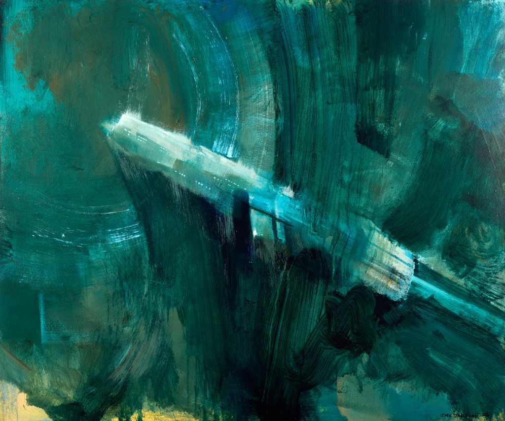
Jamie Jardine breaks his art down into three categories: landscape, abstraction and illustration. The reason for this spread is interesting.
When he enrolled in the Fine Art program at Fanshawe College in 1996, Jardine admits he didn’t know much about art history or the art world in general, and it was the Art History classes that had the biggest impact on him. So, when he started to paint, he was impressionable.
(Pictured: Jamie Jardine, “Departure”, acrylic, 24 by 20 inches. Image courtesy of Paul Lambert Photography.)
After a visit to the Dali museum in Florida during his first year at Fanshawe, he painted slightly surreal landscapes. After his first visit to the Art Gallery of Ontario, where he encountered work by members of the Group of Seven, he fell in love with the Canadian landscape. He began to exhibit his work and, when people responded positively to the landscapes, he did more.
Jardine says, “Throughout my early career I would take breaks from the landscapes, usually after an exhibition, and I’d play around with abstraction. The act of pushing paint around and playing with colours and textures really grabbed me. I began to bounce back and forth.” This became a bit of a “tug of war” for him, and he struggled to choose just one approach.
(Pictured: Jamie Jardine, “Emerging”, acrylic, 30 by 36 inches. Image courtesy of Paul Lambert Photography.)
In 2014, he left his first gallery with a lot of questions about himself, the gallery system, and the art world in general. He recalls, “In some way, I wanted to leave it all behind, but I was already pretty deep, and I was now raising two children.”
His departure from the gallery allowed him to step back and reexamine his love for art and what really interested him. He says, “I went back to my childhood interests and began painting robots on some of my discarded landscapes. The result was divisive, but for the first time in a very long while, I didn’t care what people thought.”
(Pictured: Jamie Jardine, “Heat”, acrylic, 10 by 8 inches. Image courtesy of Paul Lambert Photography. )
This was liberating for Jardine. It was also concerning; how could he continue to make a living painting, if what he painted was robots and spaceships?
Today, he paints in all three genres and enjoys each one, as does the art-loving public.
Asked what drives him to create, Jardine says, “It’s just what I do. I rarely take much pleasure from it. Satisfaction might be what I strive for.”
Art has helped him overcome periods of depression. Economic survival is another key motivator.
(Pictured: amie Jardine, “The Monster”, oil, 20 by 16 inches. Image courtesy of Paul Lambert Photography.)
Currently, Jardine has an exhibition of his sci-fi work at the St. Thomas Elgin Public Art Centre. It runs to August 22. It is his first public solo exhibition and includes preliminary work and sketches that offer insight into his process.
Jamie Jardine has been represented by local galleries since 2000 and exhibits his work through the Benz Gallery in London, Ontario.
This is the tenth in an ongoing series in which The Beat Magazine 2025 takes readers “Behind The Scenes” to meet the talented creative individuals who make the London area such a vibrant arts and culture community.
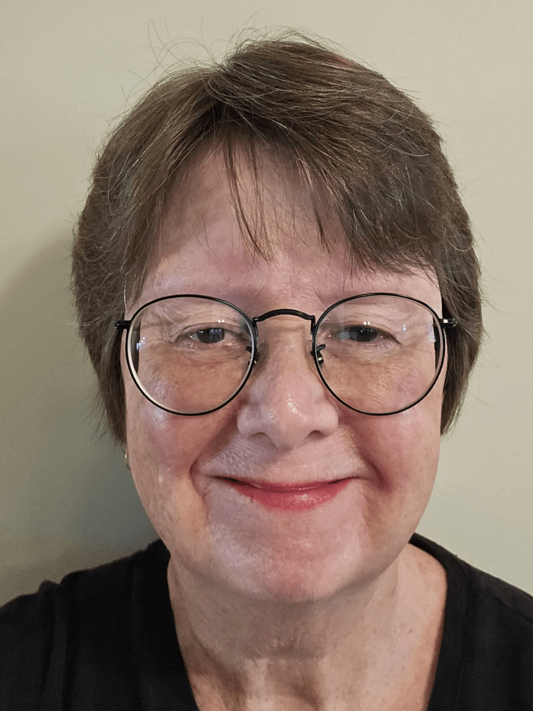
In this segment, Beth Stewart profiles former London Visual Artist Jill Price.
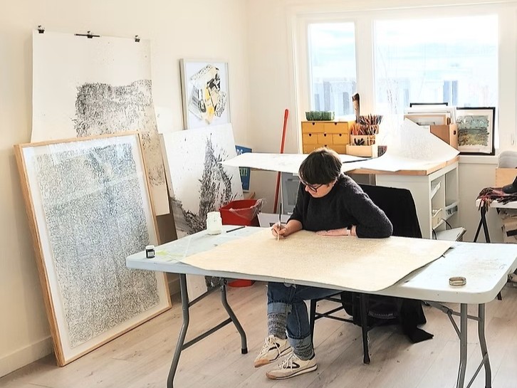
(Pictured: Jill Price, Studio 8, Barrie, Ontario. Photo by Frances Thomas.)
While former Londoner Jill Price is proficient in multiple mediums, over the past four to five years, her practice has become more process than outcome-based.
She is increasingly interested in the history and agency of materials and has come to realize how the visual arts may perpetuate the environmental harms that have preoccupied her work since 2010.
She gained understanding of the material excess and waste of the global fine art market through her research into the global fast-fashion industry while earning her MFA at OCADU. She recalls, “I was able to make connections between the two industries as well as became more informed about the proliferation of international art fairs, biennales, mass-produced art paraphernalia and the abundance of waste produced just in mounting one season of exhibitions at a large institution.”
As a result, Price seeks to “disrupt” Anthropocentric (the belief that human beings are the most important entities in the universe) perspectives.
This shift has led her to incorporate methods of unmaking and reconfiguring into her practice: she unmakes and reconfigures items that she has found, acquired, or created in the past into something new. This allows Price to put into action her concern for the planet, to repurpose materials that would otherwise contribute to Earth’s ecocide and to, hopefully, inspire others to work in more eco-ethical ways.
The list of individuals and institutions who have inspired or helped Price along the way is endless. Fortunate to have had rich educational experiences at Western, OCADU, Queens, and even during high school, she notes how she has been blessed with involvement in vibrant arts communities such as London, Barrie, Midland and Kingston, Ontario, which have led to many important friendships, mentors and business partners that have been instrumental in her professional and creative growth as an arts administrator, writer, educator, practitioner and more importantly a human.
(Pictured: Jill Price, “Undoing Geography, 2026”, reconfigured paintings on canvas, pegboard, wood panels, reclaimed coloured Ikea shelves and rotating motors, various sizes. Photo courtesy of the artist.)
Price’s installation of soft sculptures, titled “Undoing Geography”, is currently on display as part of the 2026 Kellogg’s Art Competition (https://100kellogglane.com/events/art-comp-2026). Composed of deconstructed and reconfigured landscape paintings, the piece speaks to how landscapes are always in a state of flux and how everyone experiences an environment differently.
Beyond this, Price has a new body of meditative drawings emerging on top of reclaimed drop cloths and is maintaining two other long-standing projects.
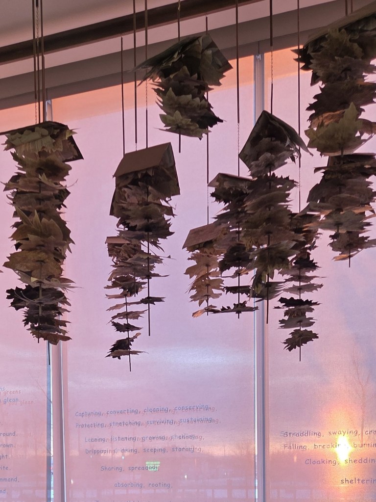
(Pictured: Jill Price, “We Are Forest, 2026”, reclaimed books, natural pigments, cardboard, poplar dowels, brass chains, wood desk, wood stool, handmade seed paper and window vinyl, various sizes. Photo courtesy of the artist.)
One is “We Are Forest”, an installation at West Gwillimbury Library, Bradford, Ontario that invites visitors to sit in the space below an assemblage of hand-dyed and hand-cut leaves constructed from old books that were slated for landfill and write a letter on hand-made seed paper on behalf of trees. Some of the letters have been planted in the library’s outdoor garden, meaning Price’s installation will long outlive the temporary exhibition of hanging paper branches.
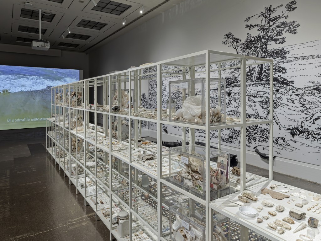
(Pictured: Jill Price, I’ve Been Here Before”, installation shot at the Art Gallery of Mississauga. Photo by Toni Hafkenscheid.)
The other ongoing body of work is Price’s “I’ve Been Here Before”. Recently exhibited at the Art Gallery of Mississauga, it is comprised of museological displays of detritus garnered from regional beach cleans. As she continues to orchestrate shoreline cleanups at home and abroad, Price’s goal is to travel the installation, titled “Wht-trSH”, to different cultural centres around Lake Ontario. Learn more about this project at: https://www.artgalleryofmississauga.com/events/ive-been-here-before-cathie-jamieson-and-jill-price/
For more on Jill Price, visit http://www.jillpricestudios.ca, @jillpricestudios, or at UN/making Network Eventbrite to participate in beach cleans. People interested in how Price integrates beach cleaning walks into her drawing practice are welcome to follow her explorations on Instagram: @drawingaswalking. Cutlines:
By Beth Stewart.
Beth Stewart is a writer, educator, and visual artist. She has a B.A. and a B.Ed. from the University of Windsor and a Diploma in Art Therapy from Western University. Beth has worked as an Art Therapist with Canadian war veterans and as a Secondary School Teacher of art and English for the TVDSB. She retired in 2024.
Beth was the arts editor at Scene Magazine from 2004 to 2006. She founded Artscape Magazine in 2006 and served as its editor until 2008. In addition, Beth wrote on the arts for Lifestyle Magazine from 2006 to 2017 and served as the copy editor for The BeatMagazine (in print) from 2009 to 2013.
As a visual artist, Beth works mainly in dry media and favours coloured pencil. Over the past decade, Beth’s focus has been on wild and domestic birds. Beth is a member of the Coloured Pencil Society of America, the Gallery Painting Group, the Eclectic Collage Collective, the Lambeth Art Association, and a founding member of the Coloured Pencil Artists of Canada group.
This is the ninth in an ongoing series in which The Beat Magazine 2025 takes readers “Behind The Scenes” to meet the talented creative individuals who make the London area such a vibrant arts and culture community.
In this segment, Beth Stewart profiles Visual Artist Cathy Horvath Buchanan.
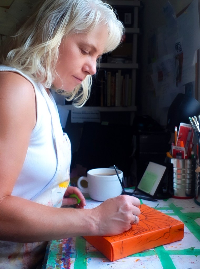
(Cathy Horvath Buchanan – the artist at work.)
For many years, Cathy Horvath Buchanan’s paintings were constructed purely from imagination and they manifested as colourful landscapes with a folk-inspired sensibility.
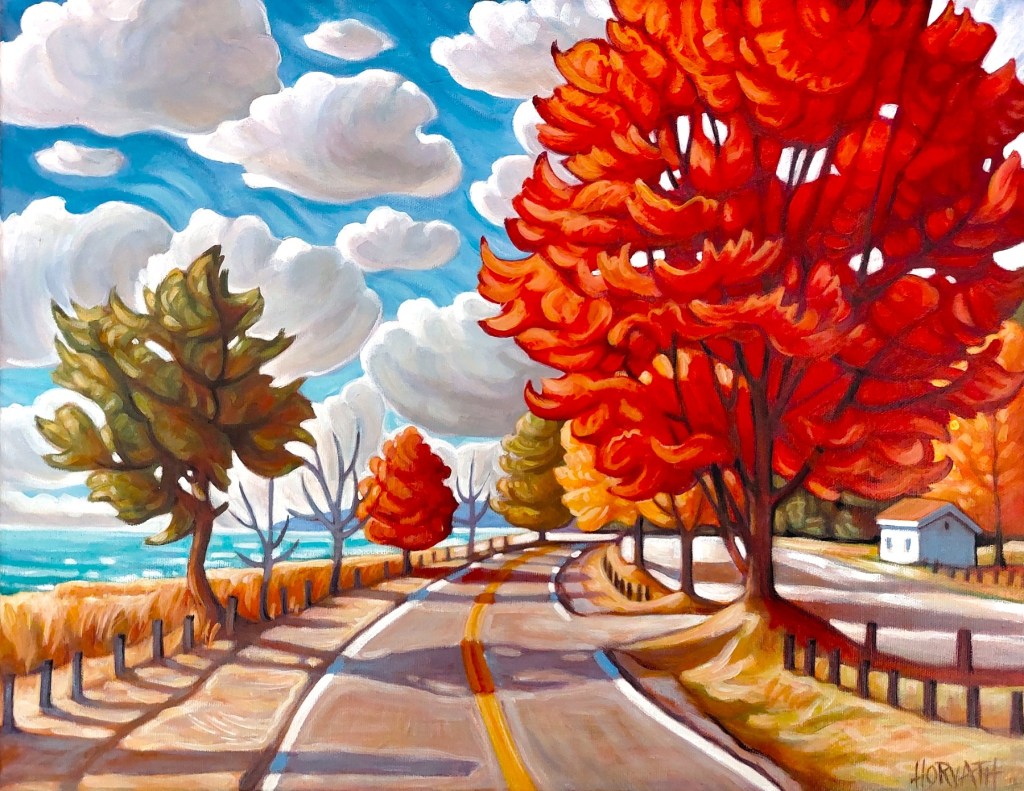
(Cathy Horvath Buchanan, “Lake Road Red Tree”, 14 by 18 inches, acrylic on canvas.)
Her current work is rooted in real-world sources. In it, she combines imagery from her plein air studies with photos from her camera roll to construct paintings. A healthy dollop of artistic licence means she still honours the colorful characteristics of her earlier work.
Horvath Buchanan explains, “The external inspiration is the starting point, but during the creation process I mutate elements in the picture, looking for ways to add colours, cast shadows, interesting lines, and use mark-making to express the dynamic mood of the view. Imagination informs most of those changes, as I freely adlib to find rhythms within the painting to accentuate the vibe of the subject.”
Horvath Buchanan is driven to create by the desire to express what she sees so she can keep it close. To commit something to canvas, she examines every aspect of her chosen subject. She says, “Once I paint something, it will always be with me.”
She makes good use of this ability to cement memory: “In the winter I paint flowers and summer landscapes because I miss and want the joy they bring me.”
Horvath Buchanan has work in local galleries, including Museum London’s gift shop, Sparta’s Gathered, Main Street Gallery in Bayfield, St. Thomas Elgin Public Art Gallery, and in venues around Port Stanley including the Art & Soul Cafe, and the Windjammer.
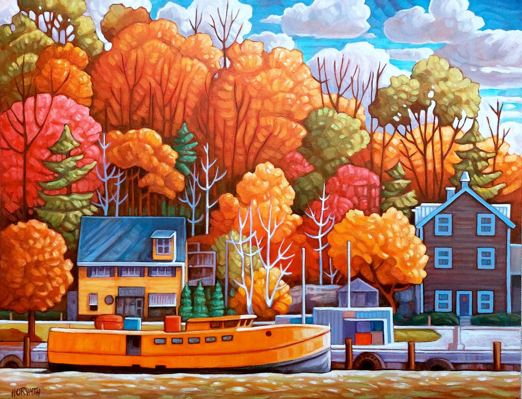
She is currently in the top 100 for the 2026 Kellogg’s Art Competition with “Golden Harbour Port”, a colourful acrylic on canvas painting of the Port Stanley harbour.
(Cathy Horvath Buchanan’s “Golden Harbour Port”, a 20-by-26-inch acrylic on canvas can be seen at the 2026 Kellogg’s Art Competition.)
She is looking forward to once again being in the Elgin County Studio Tour September 26 and 27. This is the perfect opportunity for art lovers to visit her Port Stanley studio.
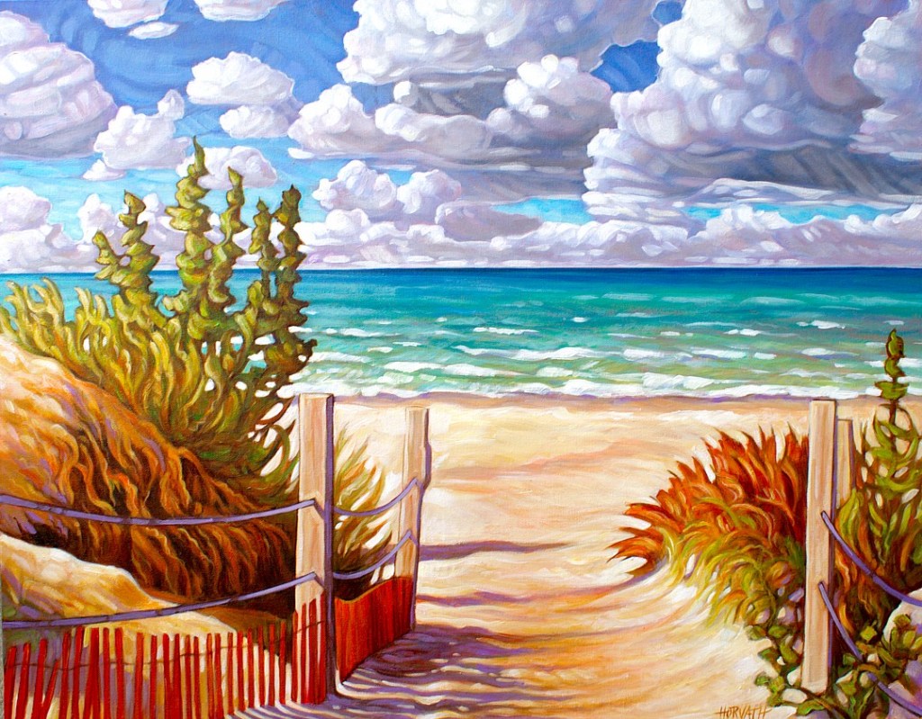
(Cathy Horvath Buchanan, “Beach Path Port Franks”, 22 by 28 inches, acrylic on canvas.)
For more information on Cathy Horvath Buchanan, and to see her online offerings of paintings, prints and more, visit her website at CathyHorvathBuchanan.com
(Pictured: Catherine Morrisey, “We are going for an adventure”, oil on canvas, 36 by 48 inches, 2026.)
Rejection. It is an inevitable consequence of being an artist. To have your proposal or work rejected is disappointing but can spur redirection. To paraphrase a line from Chumbawamba’s 1997 hit “Tubthumping”, you get knocked down, and you get up again.
Yet, rejection may trigger feelings of anger and self-doubt.
This writer recently had a residency application rejected. In an email, I was thanked for my application but informed that “after careful review by the adjudicators,” the organization was not able to offer me a place in the program. It cited limited places and a high volume of quality applications as contributing factors. It ended with, “We understand this news is disappointing for you and hope that it does not discourage you from applying to future programs.”
Was I devastated? No. Will I quit doing art? No.
London artist Catherine Morrisey is no stranger to rejection. With a lengthy career as an artist and strong exhibition history, she is a seasoned veteran of the fickleness of the art world.
Earlier this year, Morrisey had enthusiastically entered a particular art competition and encouraged others to do the same. When their pieces were rejected en masse, she felt bad. Not for herself, but for others. She wondered how she could make it better for them, how she could make them feel “appreciated.”
She thought of how a group of French painters reacted to their rejection from the annual Paris Salon over 150 years ago. They revolted. Says Morrisey, “They had a big party. They celebrated each other’s art. It was a new beginning for art.”
The annual Paris Salon began in 1667; sponsored by the French government and the Academy of Fine Arts, it was an exhibition of the best academic art. Its jury was conservative; idealized realism was expected. When, in 1863, the Salon jury refused 4,000 paintings – approximately two-thirds of the paintings submitted – the rejected artists and their friends protested.
Among the “rejects” were Édouard Manet’s “Déjeuner sur l’herbe” and James McNeill Whistler’s “Symphony in White, No. 1: The White Girl”. Both paintings were thought to be scandalous. Also rejected were works by Camille Pissarro, Johan Jongkind, Henri Rousseau, and James McNeill Whistler.
With the blessing of Emperor Napoleon III, the refused works were displayed in another part of the Palace of Industry. The resulting 1863 Salon des Refusés welcomed more than a thousand visitors per day.
Morrisey went from reaction to action and became an instigator. Not being juried in herself and hurting for her friends sparked an idea, and she ran with it.
Sandra De Salvo, executive director of the TAP Centre for Creativity, says when Morrisey presented her with the idea of aSalon des Refusés,it just felt right for her venue.
The call went out: “While sometimes challenging to face, rejection is an inherent and important part of the artistic process and an artist’s career. At the suggestion of London artist Catherine Morrisey, TAP is hosting a Salon des Refusés. Inspired by the 1863 exhibition of the same name, this exhibition highlights the important role rejection plays in finding an audience, building resilience, and growing as an artist while also acknowledging that rejection can feel exclusionary, disheartening, and disappointing.”
Eligibility was loose: “Artists must be based in London or the surrounding area. Artwork must not have been exhibited before. Artwork must have been rejected from at least one exhibit application process.”
The acceptance process was simple: “In the spirit of this exhibition, we will include as many works as possible, but the submission form will close when we have reached our maximum capacity.”
TAP’s Salon des Refusés promises to be an exhibit with a broad reach. It presents the opportunity for people to come together to connect, share experiences, and to create dialogue. De Salvo’s philosophy on rejection: “Don’t hide from it – put it out there and talk about it.”
(Pictured: Nick Hall, “I will follow you into the dark”, acrylic on canvas, 60 by 48 inches, 2024.)
Participant artist Nick Hall says, “Rejection, resilience and growth could be called the holy trinity for any serious artist because they are a proven catalyst for progress.”
But, on the flip side, he muses that not all rejection is helpful or even warranted. Rejection made on personal biases is frustrating.
He is fond of the piece he entered in the Salon. The idea for “I will follow you into the dark” came to him rather abruptly, and he felt “compelled” to capture it on canvas. Of the piece, Hall says, “Not everyone will ‘get’ it, perhaps because they fail to really look at it. To those that do, I thank you in advance.”
“Obviously, it’s not everyone’s cup of tea, so attempts made to enter it into exhibits that are naturally interested in more standard fare have failed. Until now!”
As to what he expects to get out of the Salon … “a red dot would be nice. But really, just gauging people’s reactions to it will be a treat.”
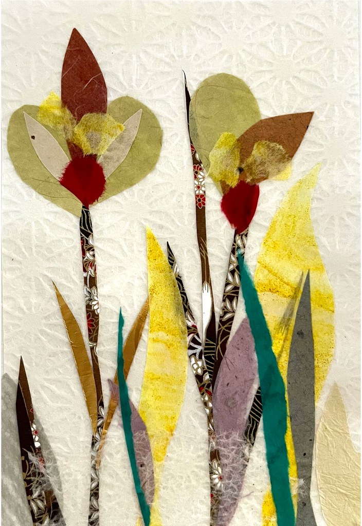
(Pictured: Gabriella Solti, “Collage I”, Japanese washi paper, 7 by 5 inches, 2026.)
Participating artist Gabriella Solti believes, while rejection is part of life, “Artists experience more of it than most because they repeatedly put themselves and their work forward – submitting to open calls, applying for grants and residencies, and pursuing professional opportunities (all very competitive arenas). Beyond making art, a good part of an artist’s practice is taking risks and putting their work and artistic practice up for scrutiny.”
She recognizes that many artists feel wounded when their artwork is rejected, and a Salon des Refusés can lighten the sting.
However, Solti’s own perspective is coloured by having been on both sides of the process. She says, “Twenty years ago, I worked as the gallery coordinator of a suburban municipal art gallery near Vancouver, where I organized open calls, coordinated jurying processes, and curated exhibitions. I know firsthand that there are far more strong artworks than any gallery has the space to exhibit thoughtfully. A rejection is rarely a definitive statement about the quality of a work. More often, it simply means that, within the specific context of a particular exhibition, the work did not align with the curator’s conceptual vision.”
Her motivation for submitting “Collage I” to TAP’s Salon des Refusés comes from her belief that “Every artwork has a receptive audience. The only way to find that audience is to continue showing the work.” Submission, then, is not only a risk – it is also an opportunity for a piece to find viewers with whom it resonates.
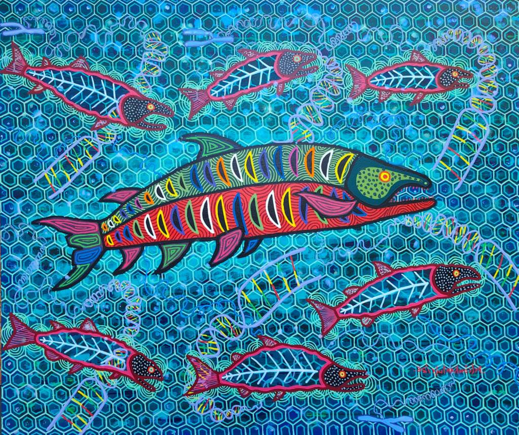
(Pictured: Oswaldo DeLeón Kantule, “Salmon Factory”, acrylic on canvas, 137 by 163 cm, 2026.)
Oswaldo DeLeón Kantule’s art is well recognized in his home country of Panama, but he has struggled to break into the Canadian market.
He says, “Though I was not born in Canada, it’s important for me to feel connected to the community where I live.”
Kantule has lived in London for almost 25 years. He painted “Salmon Factory” for a specific competition as a fusion of Canadian elements (the salmon) and elements from his culture (the mola textile pattern).
While he had submitted work to the same competition in the past and had been rejected, he thought he had a better chance this year after having been selected to participate in the 2024 Venice Biennial.
Again, he was not selected. Kantule says, “It has left me with questions.”
The Salon des Refusés allows Oswaldo DeLeón Kantule to continue cultivating a relationship with his community.
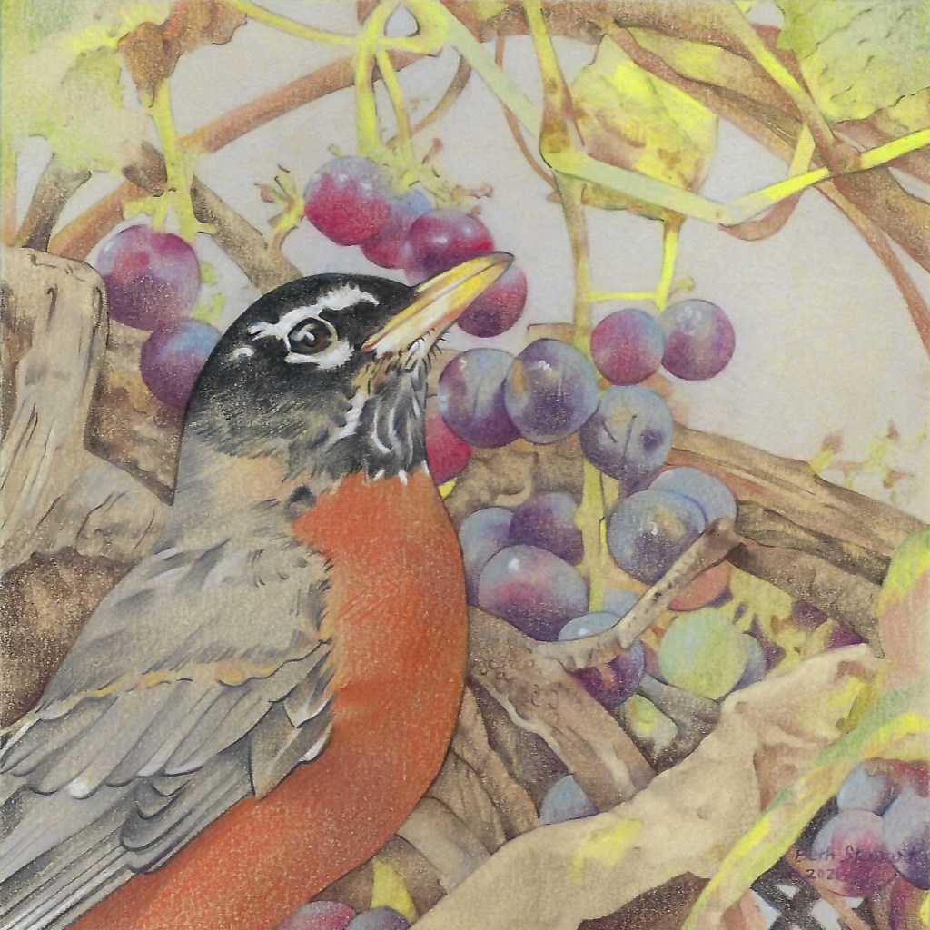
(Pictured: Beth Stewart, “Robin with Grapes, coloured pencil on Museum Board, 12 by 12 inches, 2026.)
TAP’s Salon des Refusés will be hung “salon style;” this means artwork will be hung from floor to ceiling. Thanks to visionaries like Catherine Morrisey and Sandra De Salvo, “We are going for an adventure”!
TAP’s Salon des Refusés runs from July 22 to August 15, 2026, at TAP Centre for Creativity, 203 Dundas Street. The opening reception is Saturday, July 25th, 2 to 4pm. Regular hours are Tuesday through Saturday from 12pm to 5pm. For more information, visit: https://www.tapcreativity.org/events/salon-des-refuses
By Beth Stewart
Beth Stewart is a writer, educator, and visual artist. She has a B.A. and a B.Ed. from the University of Windsor and a Diploma in Art Therapy from Western University. Beth has worked as an Art Therapist with Canadian war veterans and as a Secondary School Teacher of art and English for the TVDSB. She retired in 2024.
Beth was the arts editor at Scene Magazine from 2004 to 2006. She founded Artscape Magazine in 2006 and served as its editor until 2008. In addition, Beth wrote on the arts for Lifestyle Magazine from 2006 to 2017 and served as the copy editor for The Beat (in print) from 2009 to 2013.
As a visual artist, Beth works mainly in dry media and favours coloured pencil. Over the past decade, Beth’s focus has been on wild and domestic birds. Beth is a member of the Coloured Pencil Society of America, the Gallery Painting Group, the Eclectic Collage Collective, the Lambeth Art Association, and a founding member of the Coloured Pencil Artists of Canada group.
This is the seventh in an ongoing series in which The Beat Magazine 2025 takes readers “Behind The Scenes” to meet the talented creative individuals who make the London area such a vibrant arts and culture community.
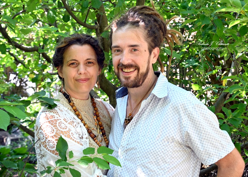
In this segment, Belinda J. Clements profiles life partners and award-winning creative collaborators Shane Wilcox and Kim Doerr, founders of Studio Shim.
(Pictured: Kim Doerr and Shane Wilcox. Photo by Belinda J. Clements.)
Who We Are
Shane & Kim: Life partners and award-winning creative collaborators for over 26 years. Together, we founded Studio SHIM in 2016 to bring intentional art directly to people and support us through one of many transitions in our lives.
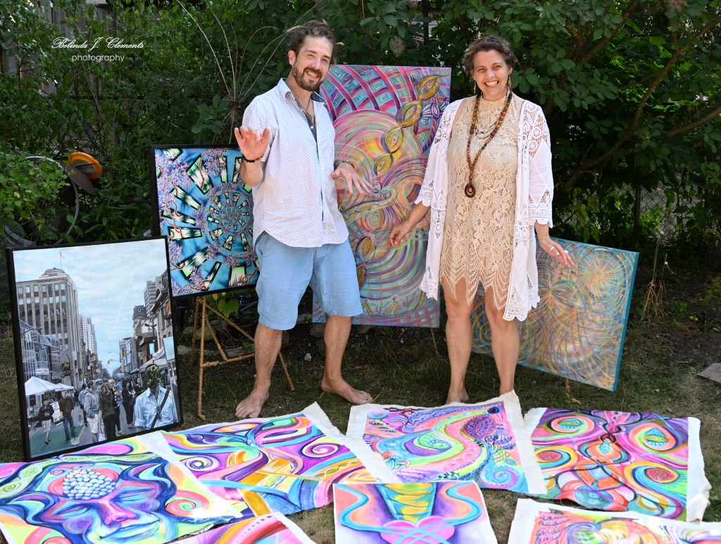
Shane: Specializes in both physical and digital mediums, creating canvas paintings, highly detailed portraiture, custom murals, professional graphic design, and original music under the moniker TaToE.
Kim: A multidisciplinary artist and eco-jeweler who manages Studio http://studioshim.ca/ and all our socials. She paints live with commUnity, and ensures every experience feels welcoming and intentional.
A completely direct connection: No agents or automated bots in the middle. When a client or supporter sends a message to Studio SHIM, we are the ones reading and replying.
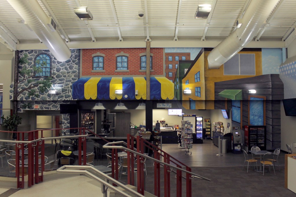
(Pictured: London International Airport. Supplied by Artists.)
2. Who We Are For
Conscious-minded people, businesses, & dreamers who care about how their environment and brand feel, and want visual art, portraits, design, and soundscapes that carry a meaningful, restorative energy.
Art lovers and collectors who crave a direct, tactile connection to real creators, not AI, and are looking to support ethical, slow-made art and independent Canadian music.
(Pictured: Shane Wilcox and Kim Doerr. Photo by Belinda J. Clements.)
3. What We Do
The Monthly Mail Club: The new creative release. Each month, we curate and ship exclusive, physical, first-edition art pieces directly to members’ mailboxes or, as requested, now digitally too. These pieces are only made available to the public on the website after Mail Club members receive their physical packages. Begins in August after the Earth Song Festival. The paintings captured by Belinda on unstretched canvas will be the first 6 months and have never been shared until now.
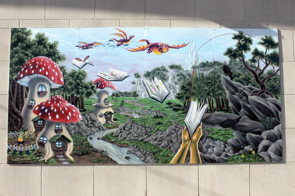
Custom Murals, Portraiture & Graphic Design: Transforming physical and digital spaces with our vibrant, large-scale custom murals, detailed portraiture, graphic design, and branding.
Original Music by TaToE: Ambient electronic soundscapes and live PA sets that serve as the sonic foundation for our entire creative universe.
Wearable Art & Eco-Fashion: Original paintings transformed into premium, slow-made apparel. Proudly manufactured in Montreal, QC (standing firmly in the 3% of apparel still made in Canada), our clothing is 100% sweatshop-free, chemical-free, and printed on fabrics with solvent-free inks.
Lunar Bliss Gatherings: Alcohol-free experiences that pair with live, improvised music by TaToE with Kim’s meditations, live creation, and intentional space-holding for offline connection. Showcases local co-creators and beyond.
( Spectrum of Imagination with Crouch Library/Crouch Neighbourhood Resource Centre, Supplied by Artists.)
4. The Heart of It (Why It Matters)
A living frequency: We believe art is energy. Well, everything is energy. From the positive vibes sewn into our Canadian-made garments to the grounding vibrations of TaToE’s music, everything we create is designed to help people feel lighter, calmer, and more present.
Sensory grounding in a loud world: In a screen-heavy, fast society, we offer something else. Through our visionary art, slow fashion, and ambient soundscapes and commUnity building, we create a space for people to breathe.
Community over commercialism: This is a decade-long, living connection. Whether wearing our art, listening to a synth bath, attending a Lunar Bliss gathering, or opening a monthly mail, you are joining a warm, supportive family built on slow creation and genuine connection.
(Pictured: Shane Wilcox and Kim Doerr. Photo by Belinda J. Clements.)
To learn more about Shane Wilcox & Kim Doerr and Studio Shim, visit:
This is the sixth in an ongoing series in which The Beat Magazine 2025 takes readers “Behind The Scenes” to meet the talented creative individuals who make the London area such a vibrant arts and culture community.
In this segment, Beth Stewart profiles Visual Artist Derek McLarty.
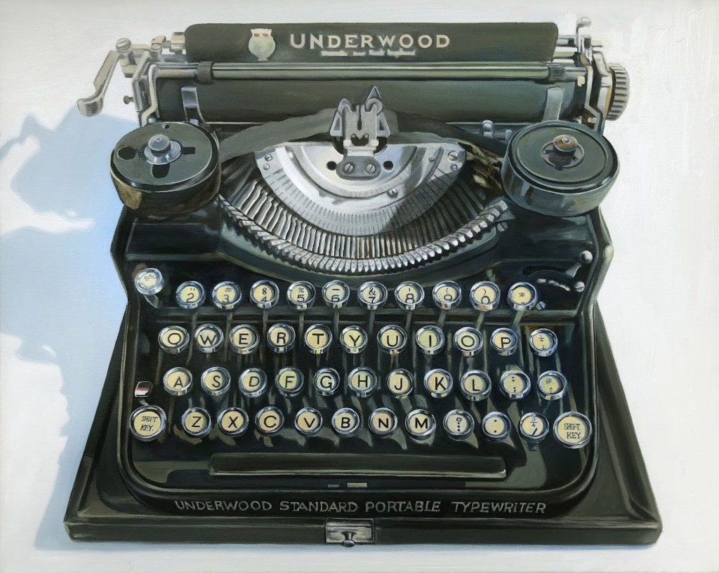
(Pictured: Derek McLarty, “Underwood”, oil on canvas, 24 by 30 inches. Image courtesy of the artist.)
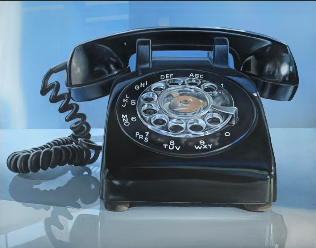
Derek McLarty paints everyday items that have acquired a certain patina as the result of their journey through time. He describes his art as a reaction to our disposable society. His subjects are often analogue objects from a time when we did not “gorge our landfills” with items whose only crime is to have fallen out of fashion. Examples are a black rotary dial phone and a quintessential Underwood typewriter.
His works evoke nostalgia as well as admonishment. He explains, “For viewers, there may be a certain nostalgia in seeing objects that they remember from childhood, but that is not my purpose. I aim to remind viewers of objects that have disappeared from everyday life to draw attention to society’s rampant consumerism.”
While he uses a representational style, he is not a slave to creating a photographic representation of his subjects. He purposely leaves visible brushstrokes and uses an “economy of marks”. He explains, “Leaving traces of the artist’s hand reminds the viewer [a painting is] human-made – rather like many of the objects represented”.
(Pictured: Derek McLarty, “Land Line version 2”, oil on canvas, 16 by 20 inches. Image courtesy of the artist.)
His drive to create is complicated. McLarty admits there is a certain satisfaction in mastering the formal aspects of painting – creating a pleasing composition, choosing colours effectively and even the craft of creating an effective illusion of reality. He also finds that painting is an effective method of communicating his dissatisfaction with society’s “addiction” to “the new, the shiny and the fashionable”.
McLarty is involved in the annual London Artists’ Studio Tour, and his work can be seen in Museum London’s shop as well as at Westland Gallery. In addition, he displays work at Marten Arts Gallery in Bayfield, in the annual Paint Ontario show, and more recently in the Summer and Grace Gallery in Oakville.
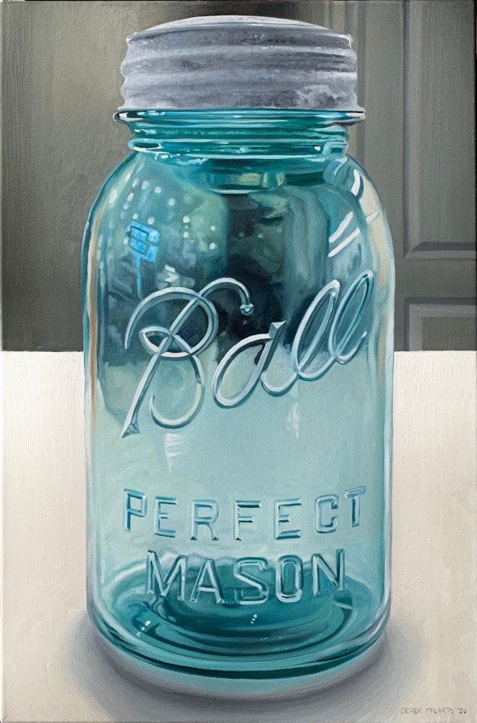
His work “Perfect Mason” is a finalist in the 2026 Kellogg’s Art Competition.
(Pictured: Derek McLarty, “Ball Mason Jar”, oil on canvas, 24 by 16 inches. Image courtesy of the artist.)
To learn more about Derek McLarty, visit www.derekmclartyart.com / Facebook: Derek McLarty / Instagram: @derekmclaryswork / Pinterest: DerekMcLartyArt
This is the fifth in an ongoing series in which The Beat Magazine 2025 takes readers “Behind The Scenes” to meet the talented creative individuals who make the London area such a vibrant arts and culture community.
In this segment, Beth Stewart profiles Visual Artist Ryan Boris Hamilton.
(Pictured: Ryan Boris Hamilton, “Woman in Glasses”, mixed media on birch wood panel, 40 by 30 inches. Image courtesy of the artist.)
Ryan Boris Hamilton is primarily a portrait and figure artist, but he explores other subjects as well. While his work varies in style, it typically starts with an acrylic base to which he adds mixed-media elements, such as drawing, wallpaper and fabric. Through layering colours and textures, he finds new ways of “framing” his subjects.
He has now worked as a professional artist for 25 years and has shown across Canada.
The BealArt graduate, who specialized in classical painting techniques, printmaking and sculpture, has lived in Toronto and Vancouver before returning to London. While in Vancouver, he wrote and illustrated a book of poetry. “The Lark, the Trees, the Stars and Me” (2012) is available on Amazon.
(Pictured: Ryan Boris Hamilton, “Woman in Hat”, acrylic on birch wood panel, 24 by 18 inches. Image courtesy of the artist.)
Hamilton has a natural urge to create. He pushes himself to the limit and strives to make each finished piece a “favourite” that must then be surpassed.
He says portraits are challenging as small mistakes have a huge impact. Consequently, it is rewarding when he nails it, and clients are thrilled with portraits of loved ones.
Hamilton was recently part of the London Artists’ Studio Tour. He is an Ontario Arts Council grant recipient and is presently working towards a solo show of his work from the last five years.
Ryan Boris Hamilton is currently in the top 100 for the 2026 Kellogg’s Art Competition. His mixed media on birchwood panel “Man on a Bench” invites viewers to engage with the subject. The figure looks off at something unseen that prompts him to smile, whilst the background is a busy and playful mix of patterns, textures, fabrics and shapes.
(Pictured: Ryan Boris Hamilton, “Man on a Bench”, mixed media on Russian birch wood panel, 36 by 24 inches. Image courtesy of the artist.)
Beth Stewart is a writer, educator, and visual artist. She has a B.A. and a B.Ed. from the University of Windsor and a Diploma in Art Therapy from Western University. Beth has worked as an Art Therapist with Canadian war veterans and as a Secondary School Teacher of art and English for the TVDSB. She retired in 2024.
Beth was the arts editor at Scene Magazine from 2004 to 2006. She founded Artscape Magazine in 2006 and served as its editor until 2008. In addition, Beth wrote on the arts for Lifestyle Magazine from 2006 to 2017 and served as the copy editor for The Beat (in print) from 2009 to 2013.
As a visual artist, Beth works mainly in dry media and favours coloured pencil. Over the past decade, Beth’s focus has been on wild and domestic birds. Beth is a member of the Coloured Pencil Society of America, the Gallery Painting Group, the Eclectic Collage Collective, the Lambeth Art Association, and a founding member of the Coloured Pencil Artists of Canada group.
This is the third in an ongoing series in which The Beat Magazine 2025 takes readers “Behind The Scenes” to meet the talented creative individuals who make the London area such a vibrant arts and culture community.
In this segment, Beth Stewart profiles visual artist Anna Wilson.
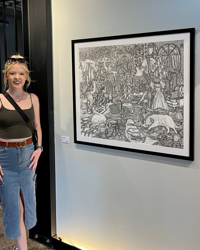
(Pictured: Anna Wilson and “Found” at 100 Kellogg. Image courtesy of the artist.)
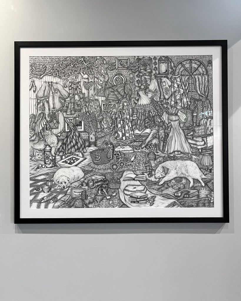
Anna Wilson is known for her intricately detailed fineliner drawings. She describes her subject as newly imagined places, inspired by real animals, architecture, furniture, and objects.
Wilson constantly takes photographs of places and things that she finds beautiful or interesting to use for reference in her drawings. She then plays with her references until they suit her vision. She explains, “I may change the pattern of a chair’s upholstery, add in flowers bursting from walls, or perspectives that have been manipulated in impossible ways.”
The sizes of her pieces run the gamut – some as small as 8 by 8 inches, others as large as 40 by 30 inches.
Wilson has always been passionate about art. Over time, her zeal has matured into commitment as she has discovered her medium and honed her style. She credits art teachers Erica Reshef of Artventure Art Studio and Leslie Putnam of Banting Secondary School, as well as her supportive family, with inspiring her to pursue a career as an artist. Wilson subsequently graduated from Western University in 2018, where she studied visual art and psychology.
Art lovers will see a lot of Wilson’s work in the months to come. Her drawing “Found” was chosen as one of the Top 100 pieces in the 2026 Kellogg’s Art Competition.
(Pictured: Anna Wilson “Found”, fineliner on paper, 30 x 36. Image courtesy of the artist.)
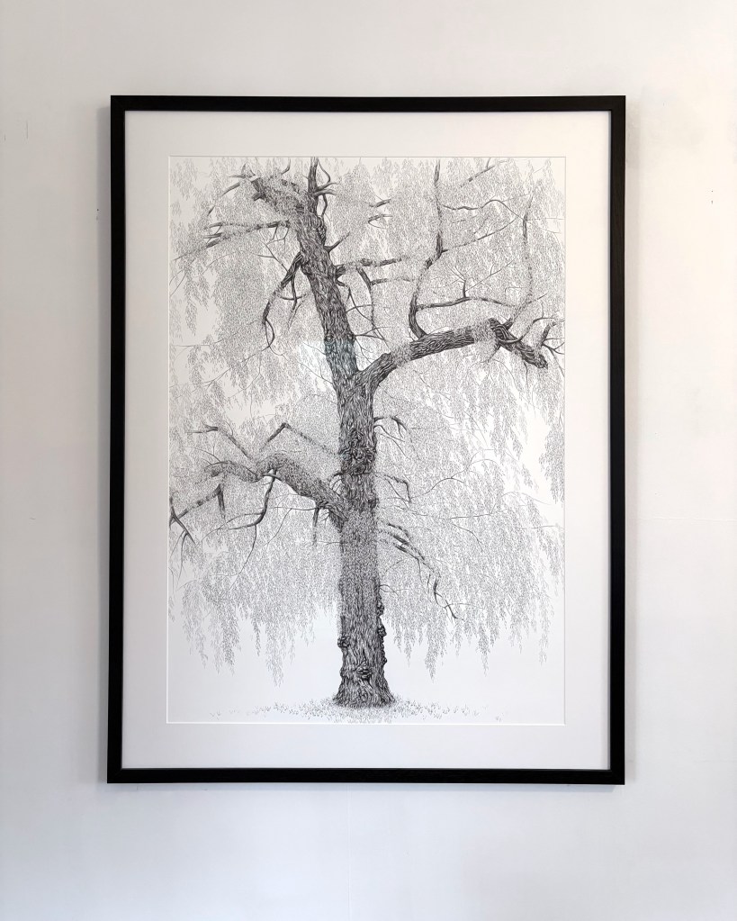
Her willow tree drawing, “Graceful,” will be in “Visual Elements 68” opening at Woodstock Art Gallery on July 11th. It’s Wilson’s first time showing in Woodstock.
(Pictured: Anna Wilson, “Graceful”, fineliner on paper, 40 x 30. Image courtesy of the artist.)
Anna is also preparing for a show at Westland Gallery, 247 Wortley Road, from August 25 to September 26. It will showcase her “Every Last Leaf” series, a new collection of highly detailed drawings of willow trees and birds, the result of her burgeoning passion for nature.
To learn more about Anna Wilson, visit www.annawilsonart.ca or check her out on Instagram/Facebook: @anna_wilson_art